DIGIX GLOBAL
DIGIX GLOBAL
DIGIX GLOBAL
Bringing Digix’s web and mobile experience
Bringing Digix’s web and mobile experience
Bringing Digix’s web and mobile experience
My Role
I participated on the research process and led the UI Design team of the new Digix's marketplace and the new website for mobile and desktop since the outset of the project in January 2019. I was also responsible for Digix Design System in order to ensure consistency throught different platforms.
Up until July 2020, I led efforts to evolve the service and address customer pain‐points related to the experience.
My Role
I led the UI Design team of new Digix's marketplace and the new website for mobile and desktop since the outset of the project in January 2019. I was also responsible for Digix Design System in order to ensure consistency throught different platforms.
Up until July 2020, I led efforts to evolve the service and address customer pain‐points related to the experience.
My Role
I led the UI Design team of new Digix's marketplace and the new website mobile and desktop since the outset of the project in January 2019.
Up until July 2020, I led efforts to evolve the service and address customer pain‐points related to the browse and discovery experience.
Basics
Design Lead: Shawn Tsang
UX Design Lead: Heloise Juteau
Senior Product Designer: Fabricio Goes
Basics
Design Lead: Shawn Tsang
UX Design Lead: Heloise Juteau
Senior Product Designer: Fabricio Goes
Goals
- Reduce the long KYC registration process
- Give users a unique experience when purchasing DGX, thus ensuring more control over their time and money
- Create a memorable dashboard for a deeper engagement
My Role
I led the UI Design team of new Digix's marketplace and the new website for mobile and desktop since the outset of the project in January 2019. I was also responsible for Digix Design System in order to ensure consistency throught different platforms.
Up until July 2020, I led efforts to evolve the service and address customer pain‐points related to the experience.
My Role
I led the UI Design team of new Digix's marketplace and the new website mobile and desktop since the outset of the project in January 2019.
Up until July 2020, I led efforts to evolve the service and address customer pain‐points related to the browse and discovery experience.
Achievements
• Simplified KYC Process: Successfully reduced the KYC process from 6 to 3 steps, streamlining user onboarding
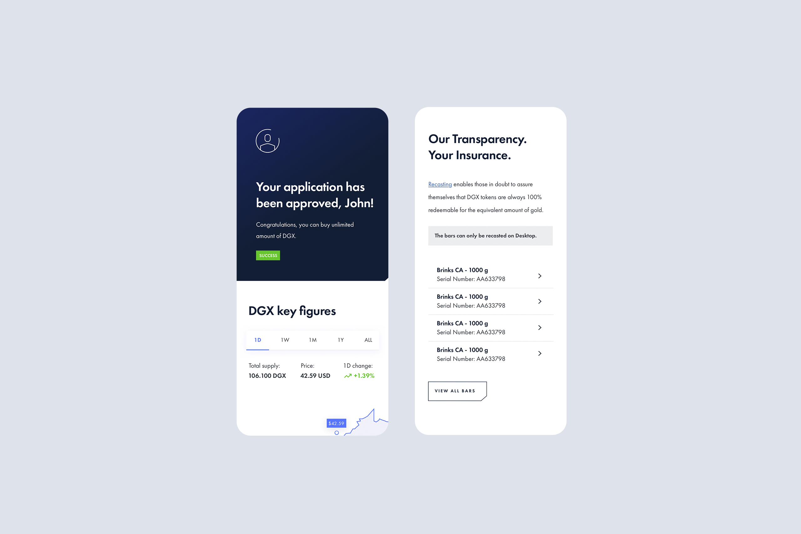
• Enhanced asset transparency: Designed and implemented a dashboard that integrates Digix's Proof of Provenance protocol, which allows users to trace every movement of physical gold backing DGX tokens.
• Improved user experience with gold redemption: Designed and optimized the user interface for gold redemption, enabling users to easily redeem gold bullion from custodial vaults in Singapore and Canada.
Basics
Design Lead: Shawn Tsang
UX Design Lead: Heloise Juteau
Senior Product Designer: Fabricio Goes
Discovery
We conducted customer and market research to drive our planning phase. We found some key insights that defined the launch version of the product.
Discovery
We conducted customer and market research to drive our planning phase. We found some key insights that defined the launch version of the product.

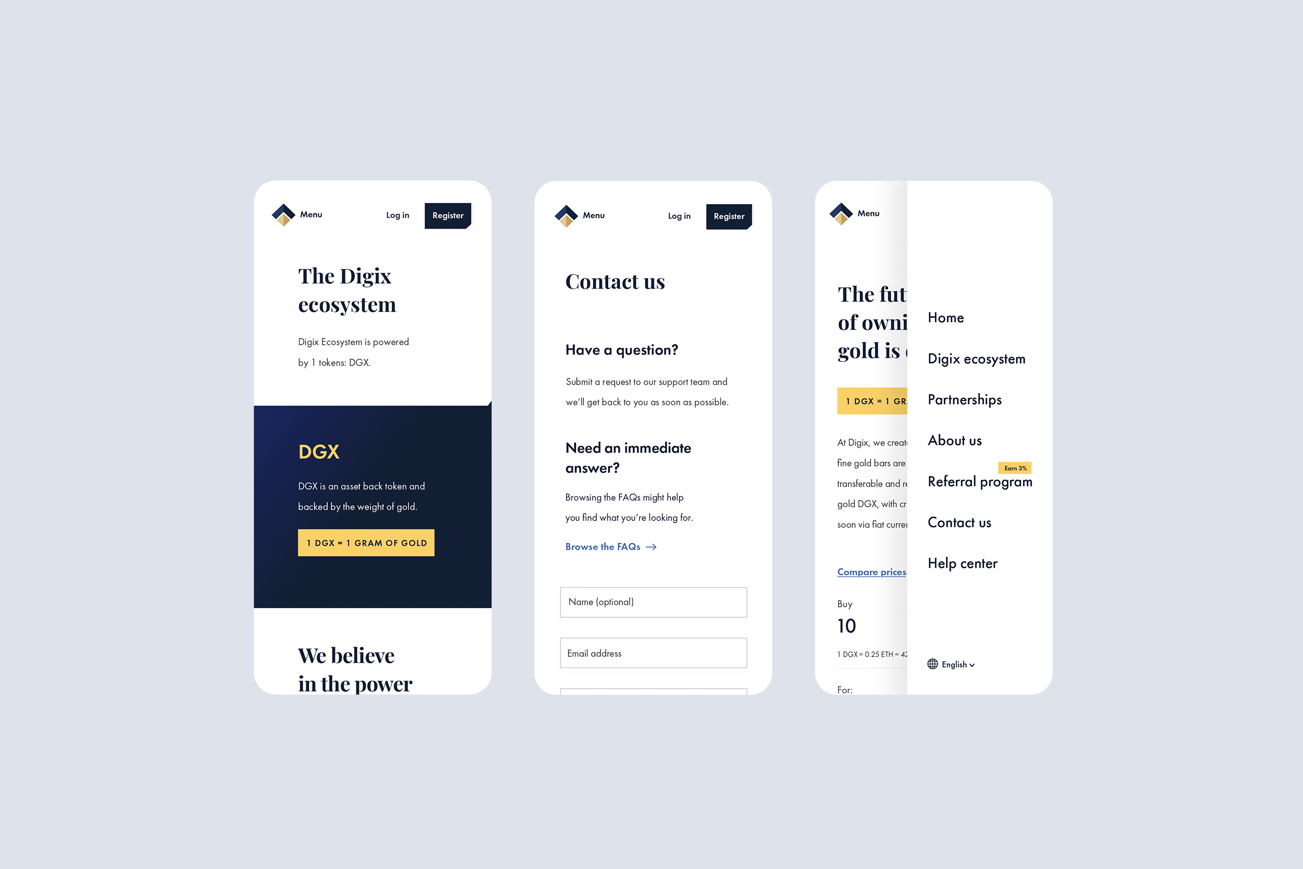
The previous website
Digix's old website lacked a linear structure and visual consistency, as the website was too dense with dark colors in the background, which hindered the understanding and hierarchy of information.
The previous website
Digix's old website lacked a linear structure and visual consistency, as the website was too dense with dark colors in the background, which hindered the understanding and hierarchy of information and made it an ineffective experience.
The previous dashboard
Similar to the website, the old dashboard didn't have a clear structure, visual harmony/consistency and had a lengthy process for KYC which caused most users to give up on registration.
The previous dashboard
Similar to the website, the old dashboard didn't have a clear structure, visual harmony/consistency and had a lengthy process for KYC which caused most users to give up on registration.
How we got there
The biggest challenge I faced throughout this project was balancing moving forward with designs, design system, whilst collaborating with the research team.
Handle feedback was even more challenging as the team spent a disproportional amount of time debating design decisions. As the research was evolving, we stated some design principles that helped to create visibility into the decision‐making process.
Personal and personalized
Learn and grow with the customers over time and provide features for them to feel at home.
Personal and personalized
Learn and grow with the customers over time and provide features for them to feel at home.
Personal and personalized
Learn and grow with the customers over time and provide features for them to feel at home.
Curated content
Curated content really matters when the subject is how to invest on blockchain and help users to get know the product.
Curated content
Curated content really matters when the subject is how to invest on blockchain and help users to get know the product.
Curated content
Curated content really matters when the subject is how to invest on blockchain and help user to get know the product.
Design for the experience
Optimize customer experiences at all touchpoints
before, during KYC Process and through the buying process in order to nurture strong customer-brand relationships.
Design for the experience
Optimize customer experiences at all touchpoints before, during KYC Process and through the buying process in order to nurture strong customer-brand relationships.
Design for the experience
Optimize customer experiences at all touchpoints before, during and after conversion and nurture strong customer-brand relationship.
Fit and aesthetics matter
Pixel precision, strong copywriting and eye-catching details build trust with the customers.
Fit and aesthetics matter
Pixel precision, strong copywriting and eye-catching details build trust with the customers.
Buy DGX is the experience
The great experience is one that inspires and intensifies the customer relationships.
Buy DGX is the experience
The great experience is one that inspires and intensify the customer relationship.
The controversial ’Buy Button’
This button had a great action in the user flow, both on the website and on the dashboard, so we decided to give it its deserved importance in this case.
It was one of the most controversial design decisions for our team as I spent more time commenting on these design decisions than solving the design problem! The two areas that were most debated related to:
What the button looked like?
What the button said?
We started the design process with the Think & Feel exercise from Gamestorming. However, we focused on the emotion point of view that users related with the Digix symbol(cut off corner) in the research process , and then applied this concept to the button.
After getting up the strengths and weaknesses of the explorations, I narrowed down to two competing design concepts: a square button and a cut off corner button. As to our decision, we put together a plan for user testing.
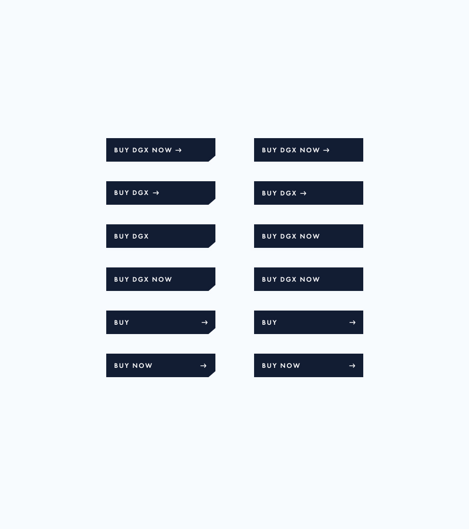
Testing the buttons
Testing the two button options with 12 participants revealed that:
- Customers were delighted by the cutting edge corner
- Customers could identify the content easily on ’Buy DGX Now’ button
- Customers thought that after clicking on buy they would own the DGX
Testing the buttons
Testing the two button options with 12 participants revealed that:
- Customers were delighted by the cutting edge corner
- Customers could identify the content easily on ’Buy DGX Now’ button
- Customers thought that after clicking on buy they would own the DGX
Design process
Based on the insights above, I felt good enough to move forward with the cutting off button design because I knew (according to the research) it would be very disruptive and effective in the industry.
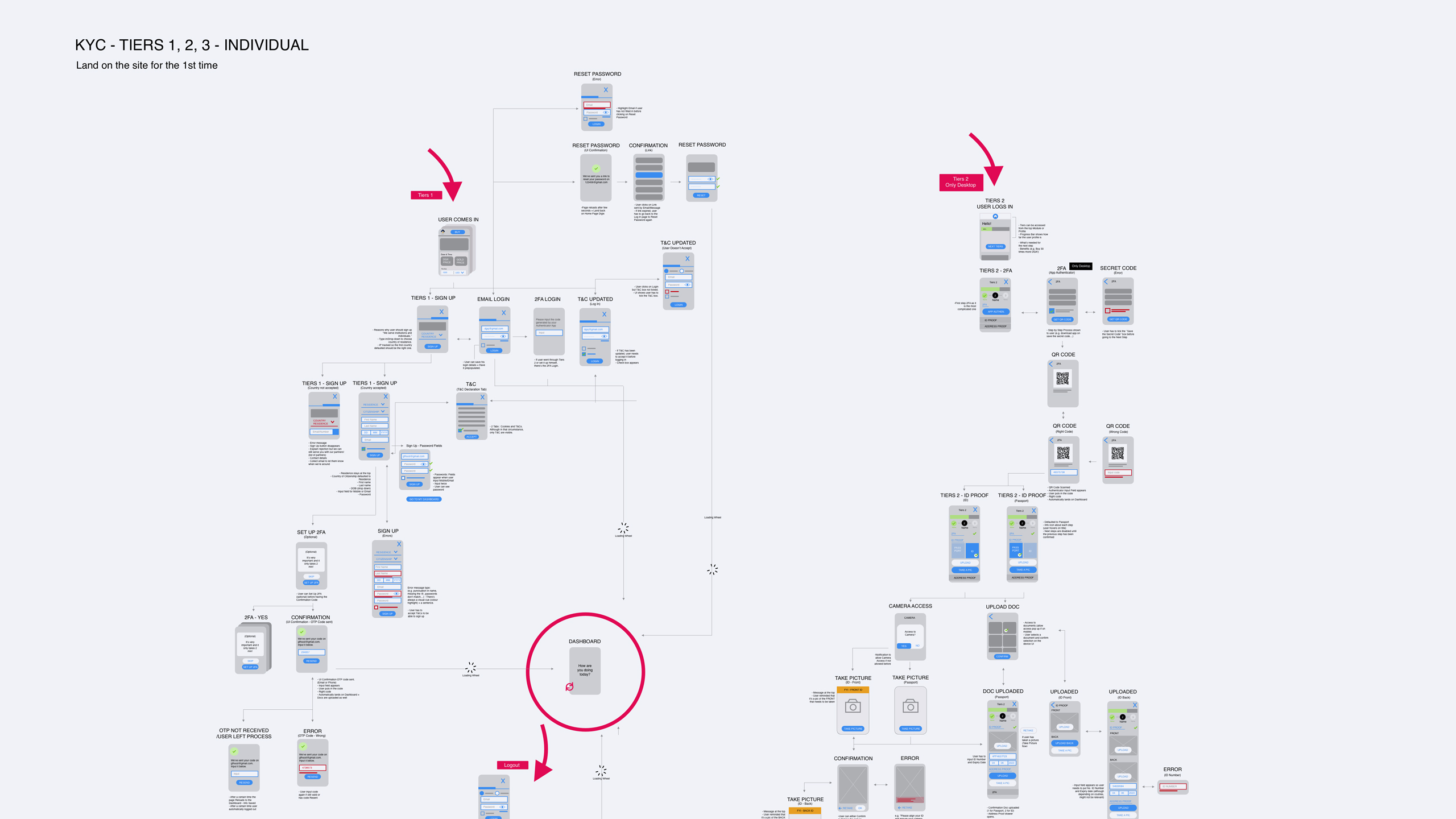
My design process involved sketching concepts and user flows with the user experience leader and project managing partner and then translating them directly into high-fidelity design pieces, as I had done already designed several components of the styleguide, so it was relatively easy to go straight to high fidelity designs.
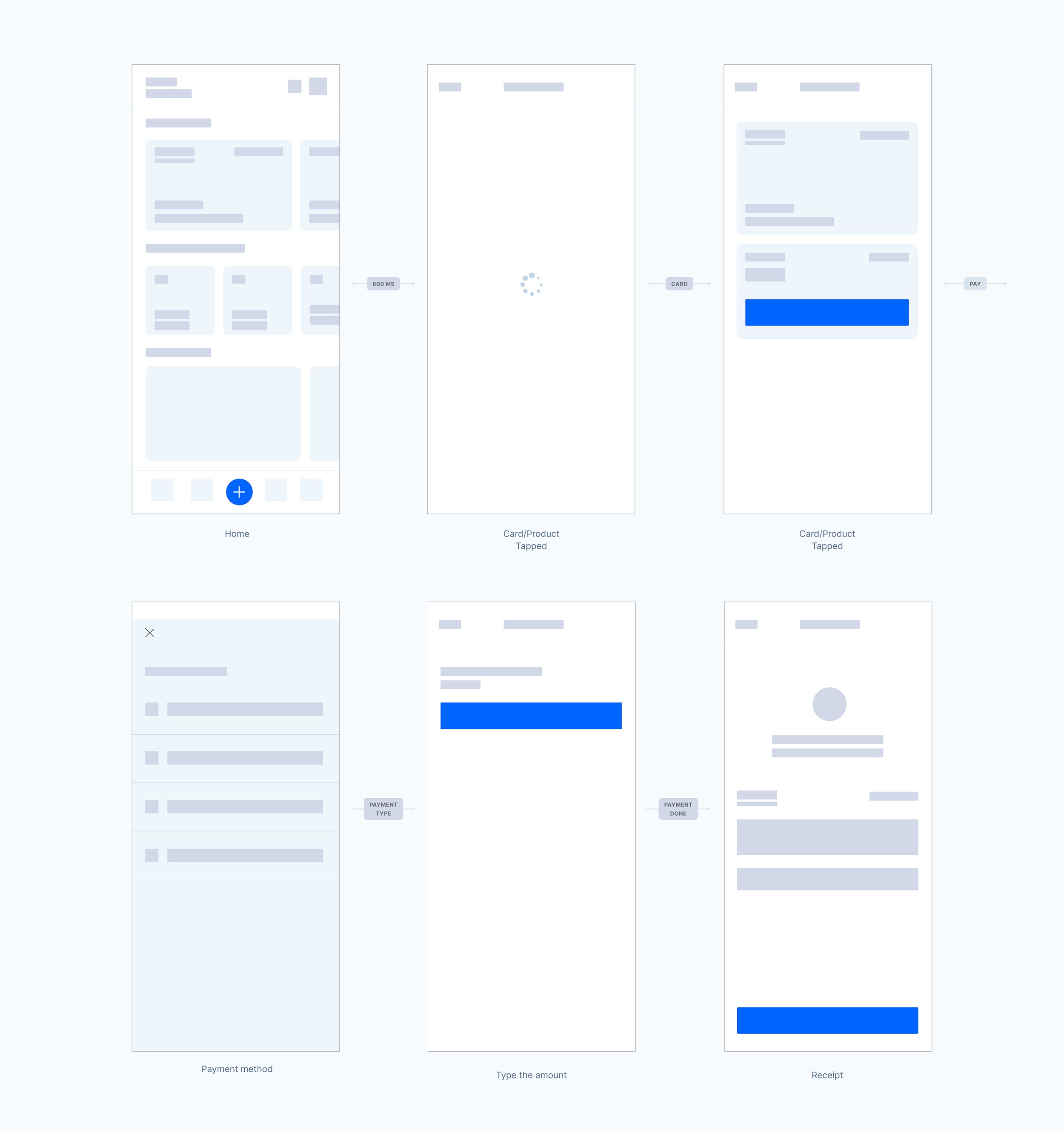
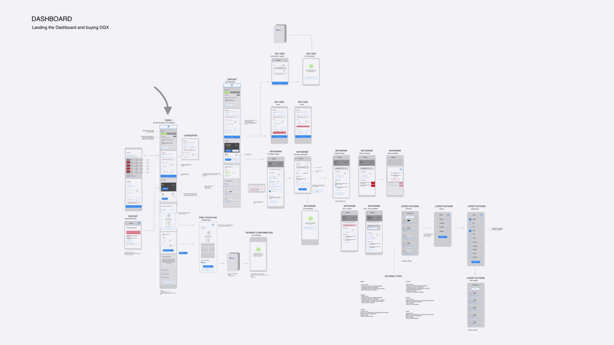
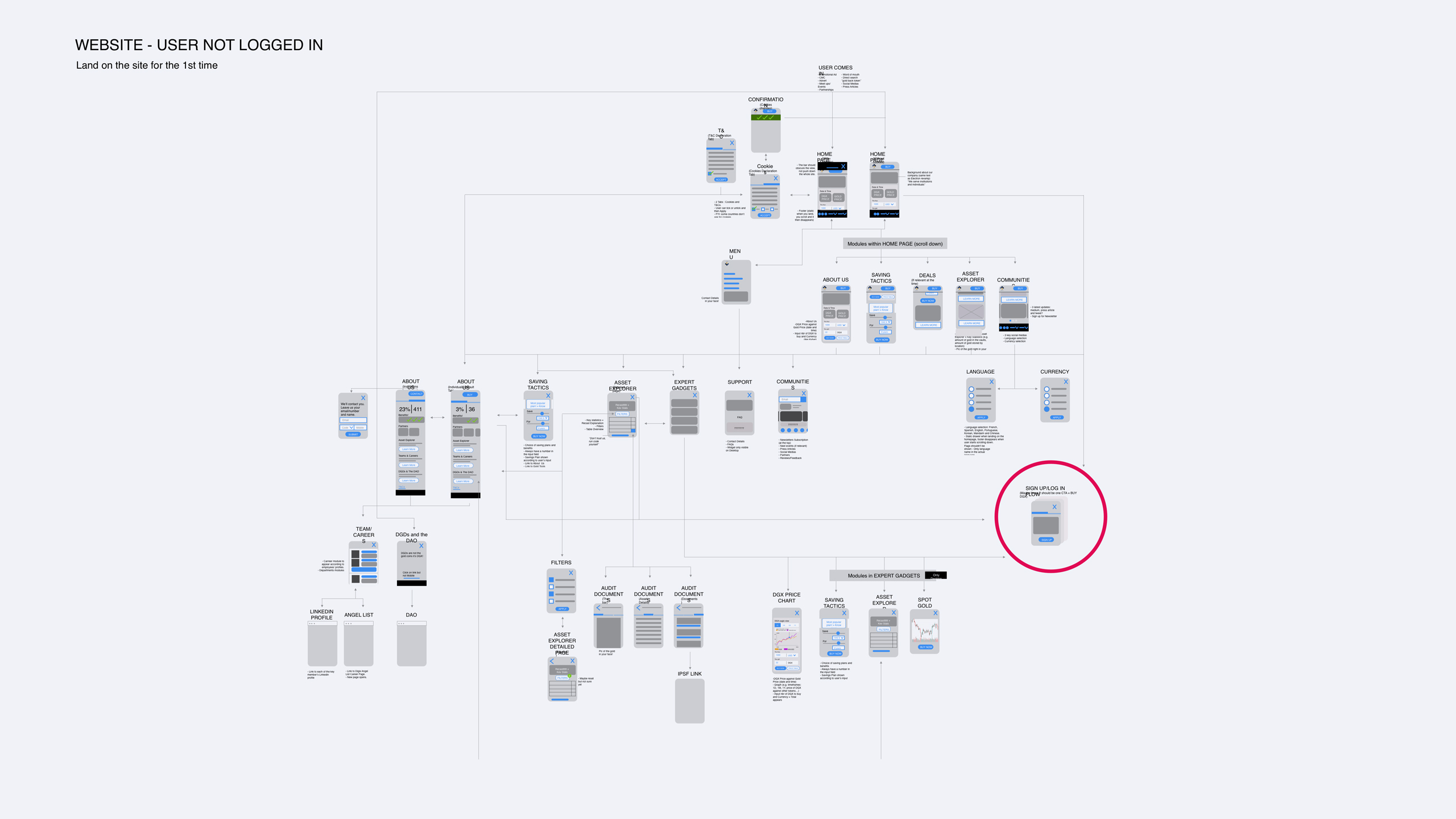
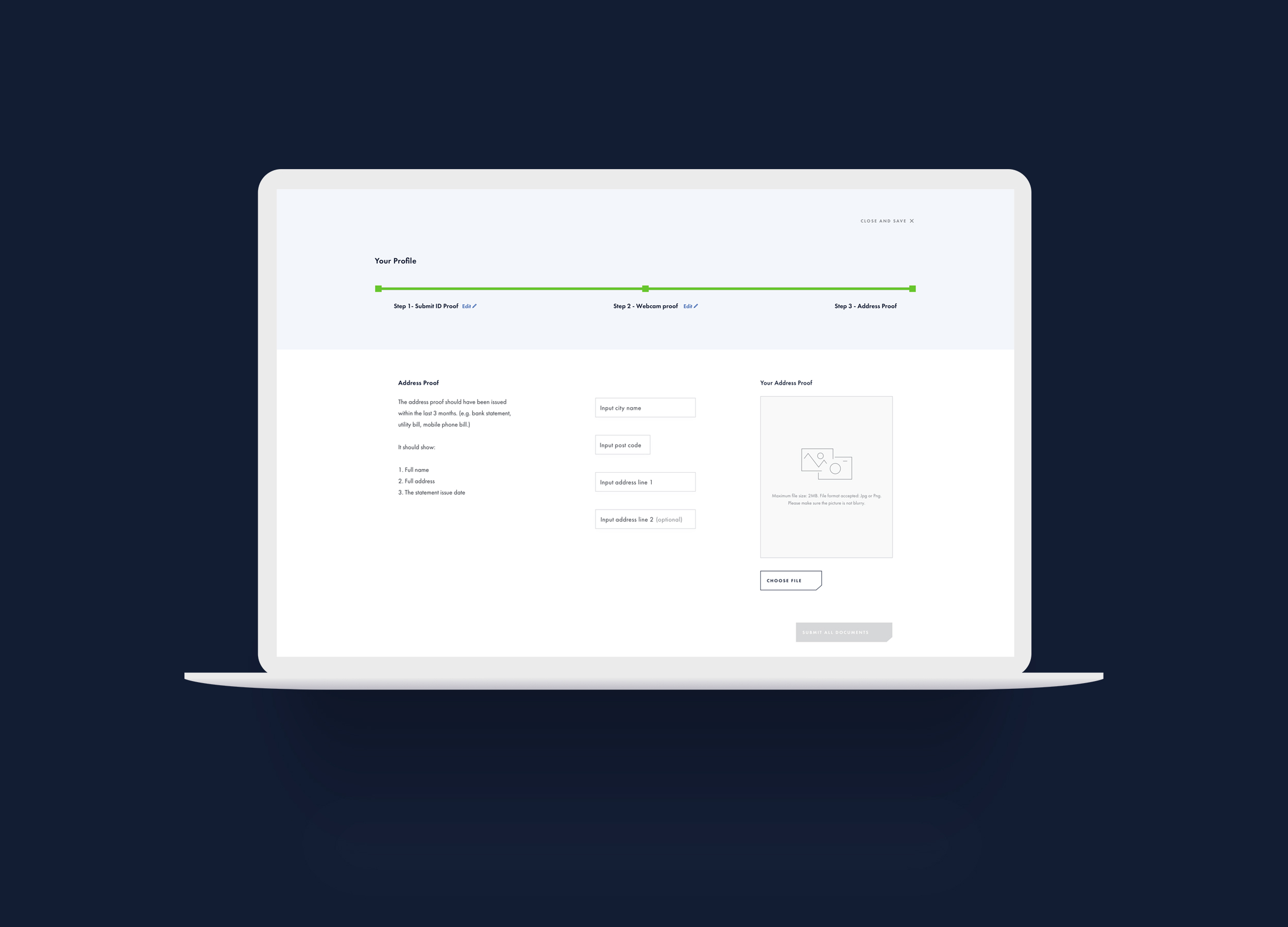
Below we have the user flow for KYC Process, Website and Dashboard as well as a high-fidelity prototype of the dashboard for Desktop.
Design process
Based on the insights above, I felt good enough to move forward with the cutting off button design because I knew (according to the research) it would be very disruptive and effective in the industry.
My design process involved sketching concepts and user flows with the user experience leader and project managing partner and then translating them directly into high-fidelity design pieces, as I had done already designed several components of the styleguide, so it was relatively easy to go straight to high fidelity designs.
Below we have the user flow for KYC Process, Website and Dashboard as well as a high-fidelity prototype of the dashboard for Desktop.
Design process
Based on the insights above, I felt good enough to move forward with the cutting off button design because I knew (according to the research) it would be very disruptive and effective in the industry.
My design process involved sketching concepts and flows with the user experience leader and project managing partner and then translating them directly into high-fidelity design pieces, as I had already designed several components of the styleguide, so it was relatively easy to go straight to high fidelity designs.
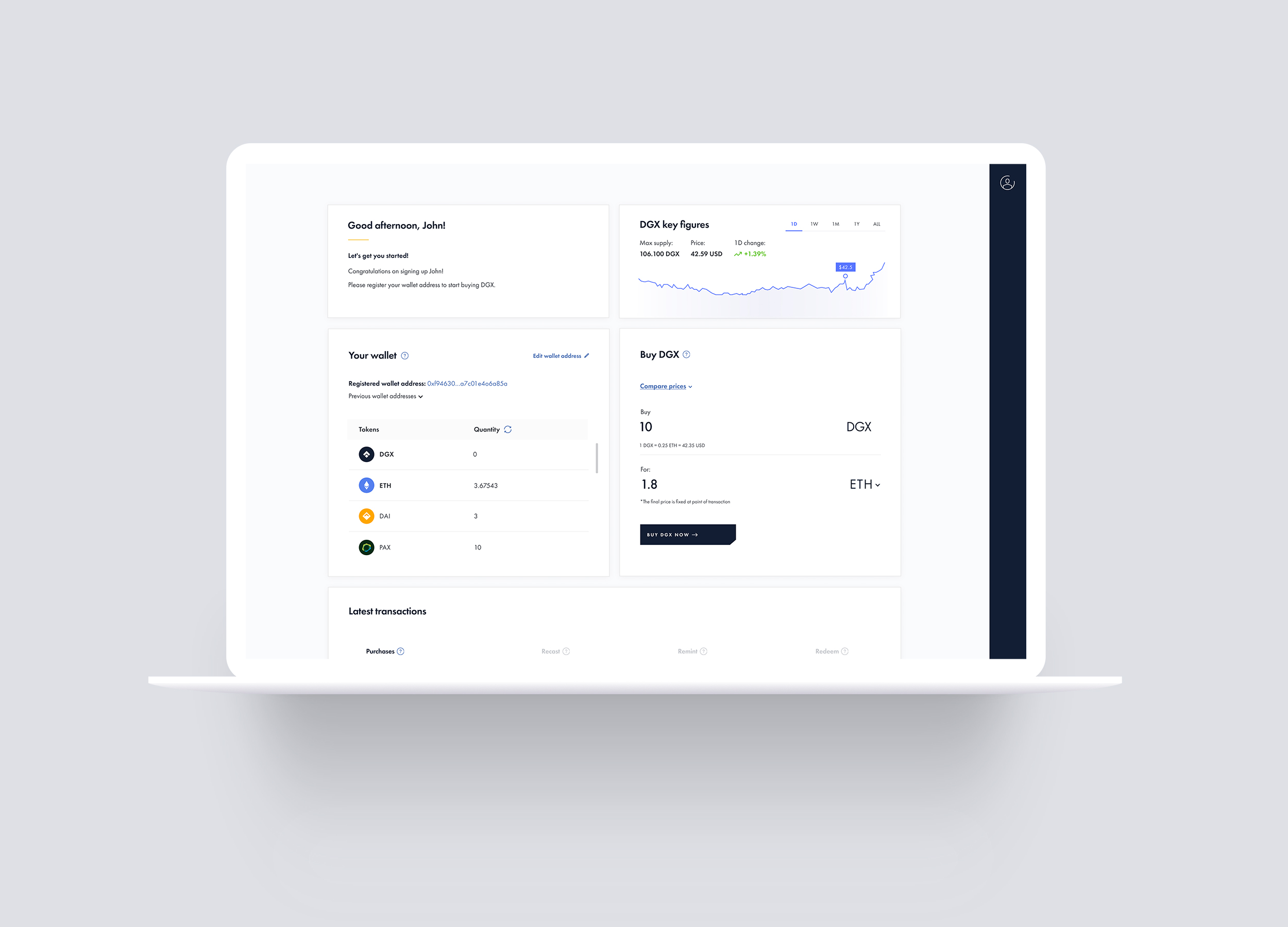
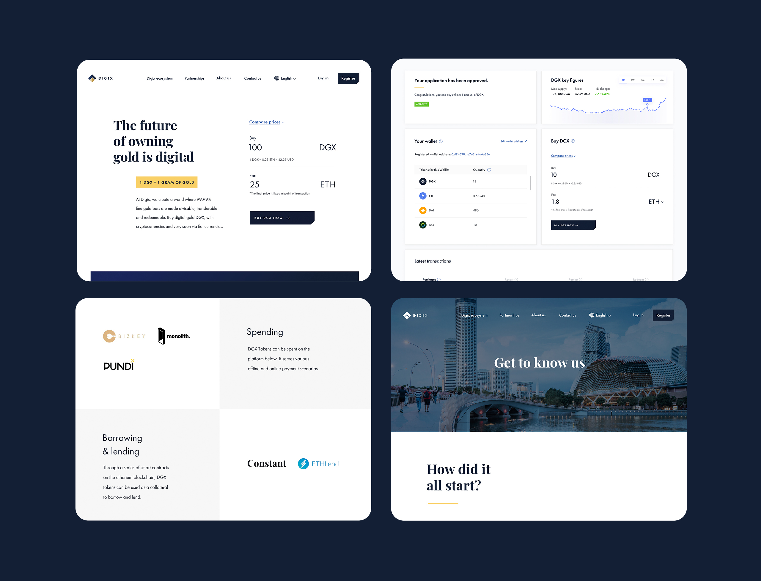
Below we have a high-fidelity prototype of the dashboard for Desktop.
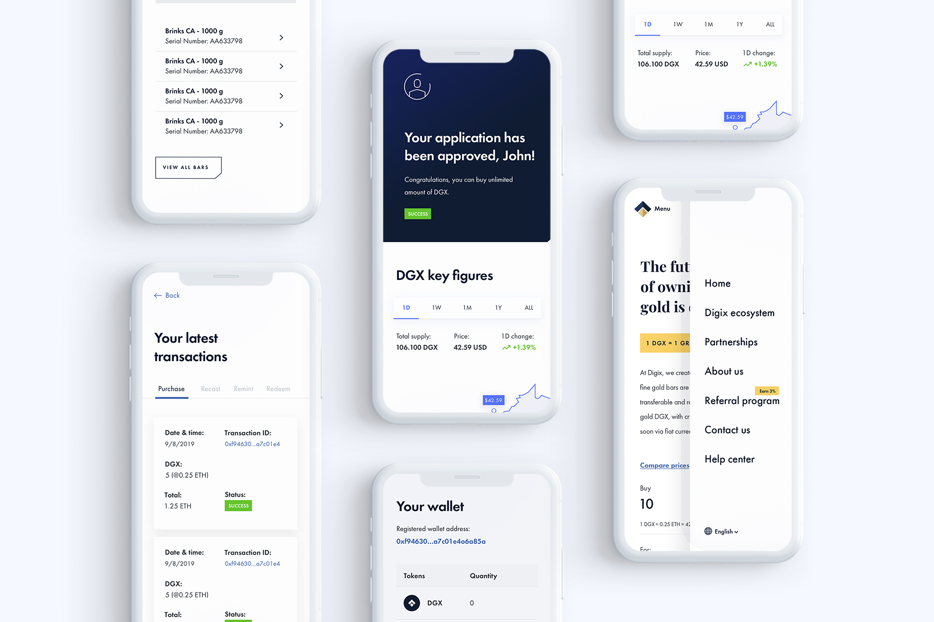
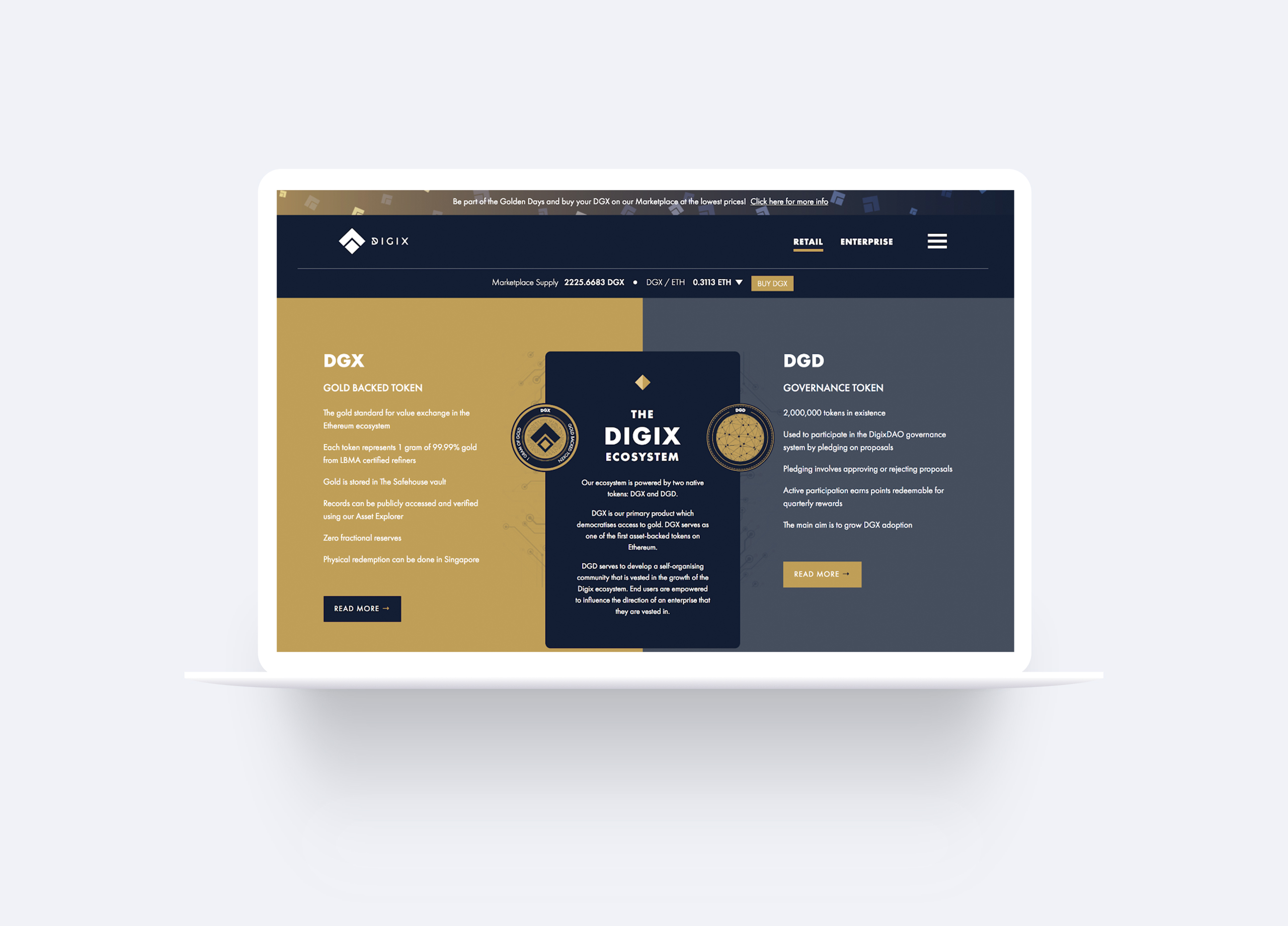
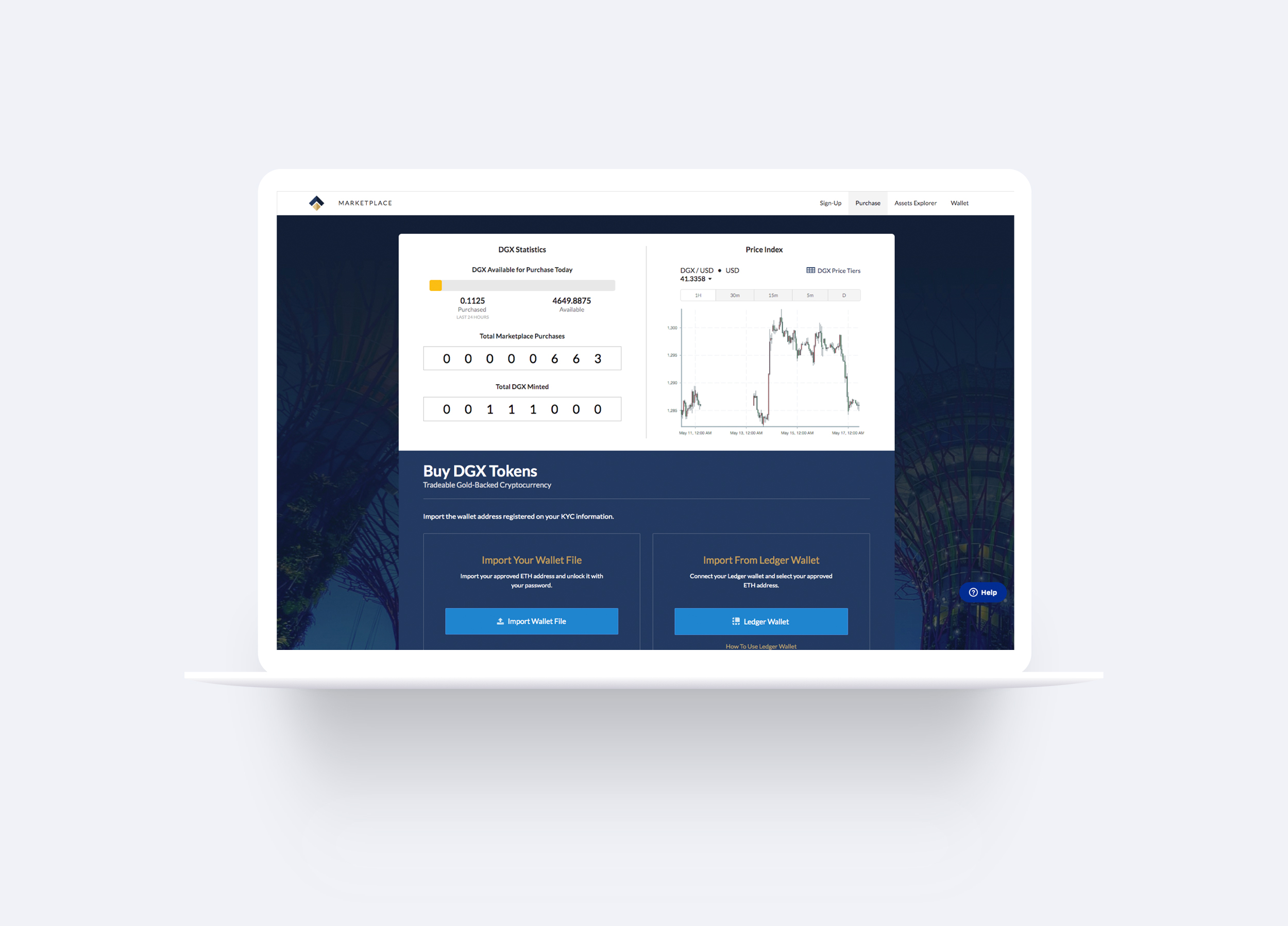
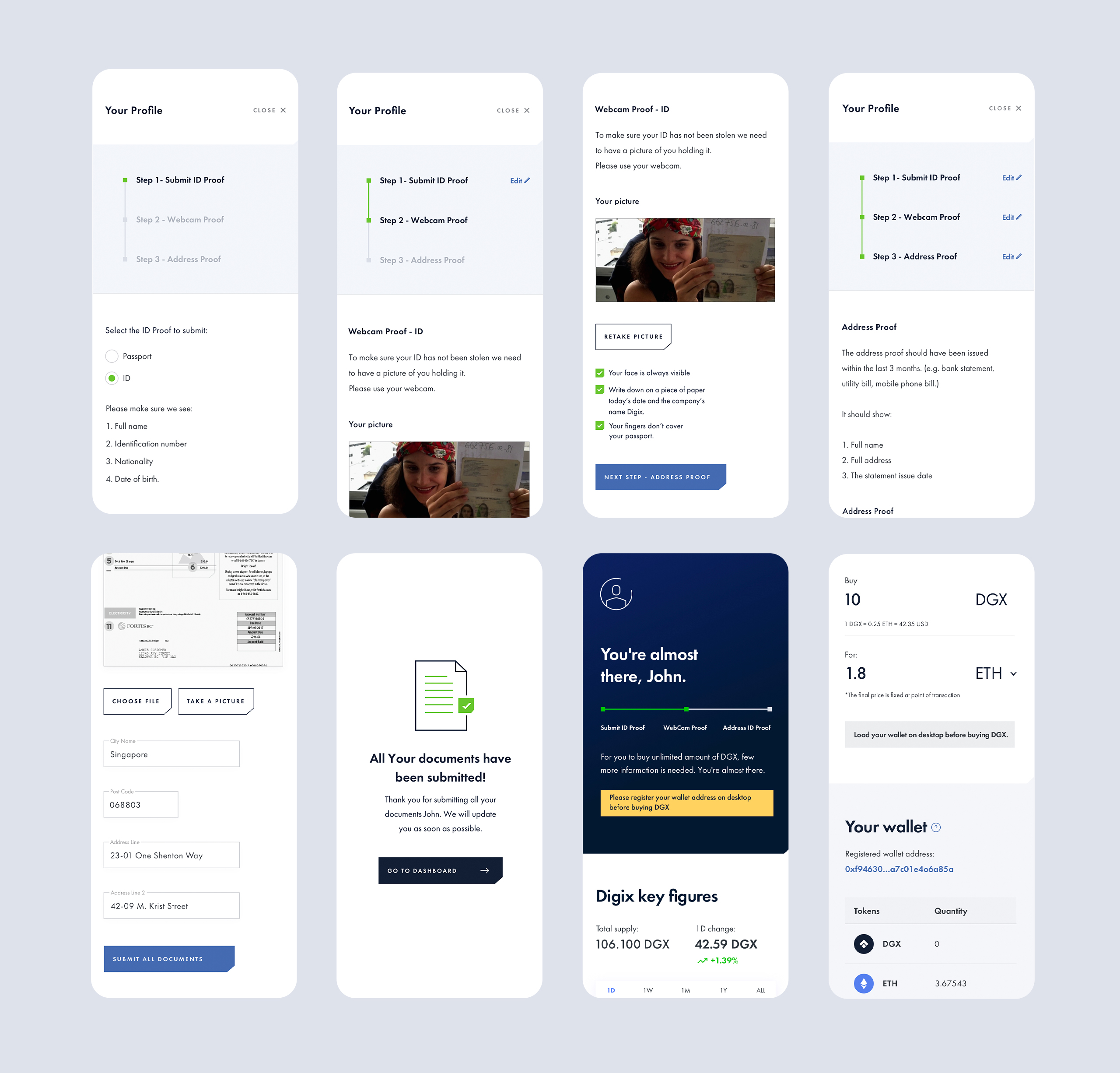
Bringing it all to life
The images below show some dashboard screens, KYC Process as well as the website for Desktop and Mobile.
Bringing it all to life
The images below show some dashboard screens, KYC Process as well as the website for Desktop and Mobile.
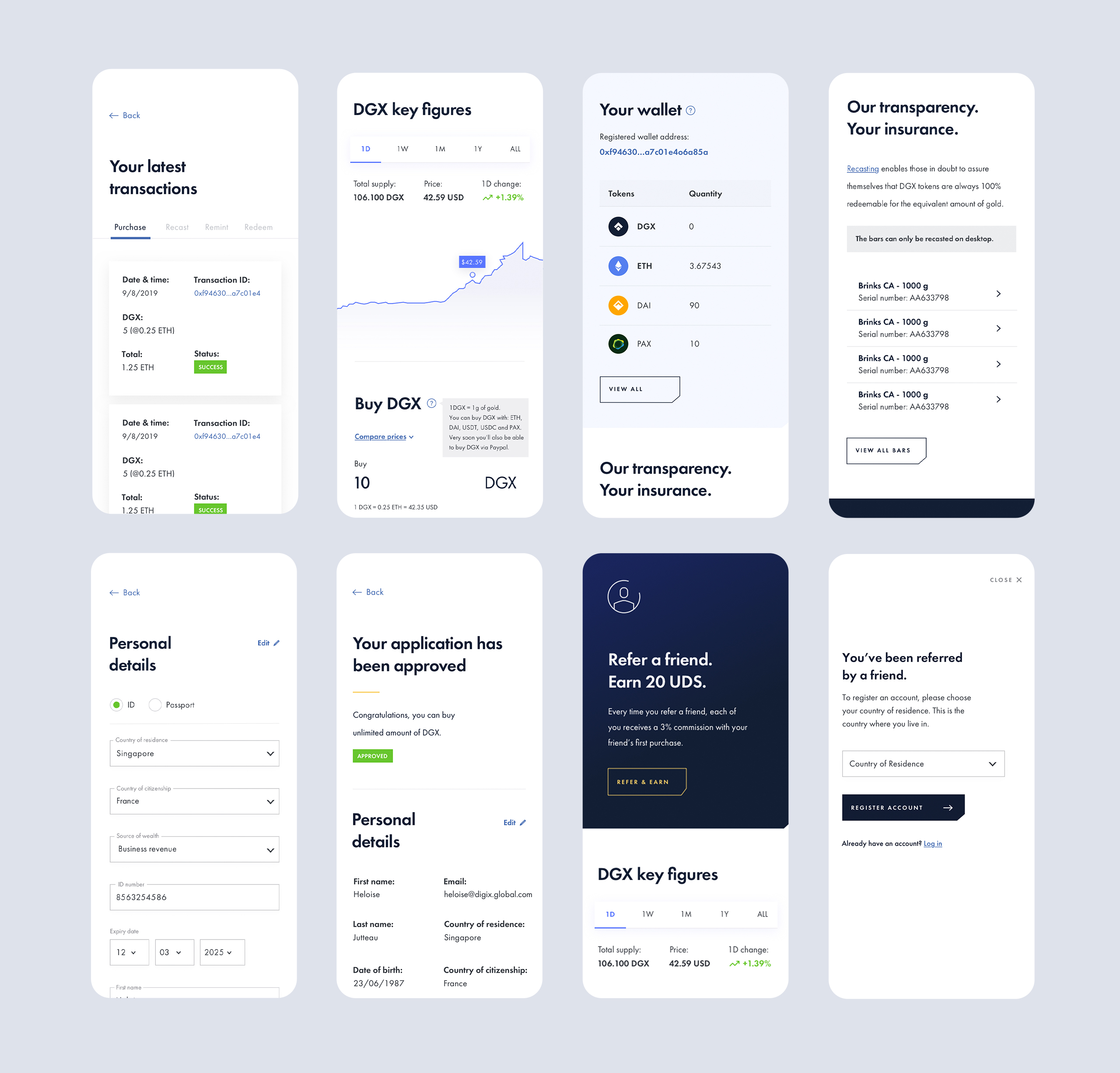
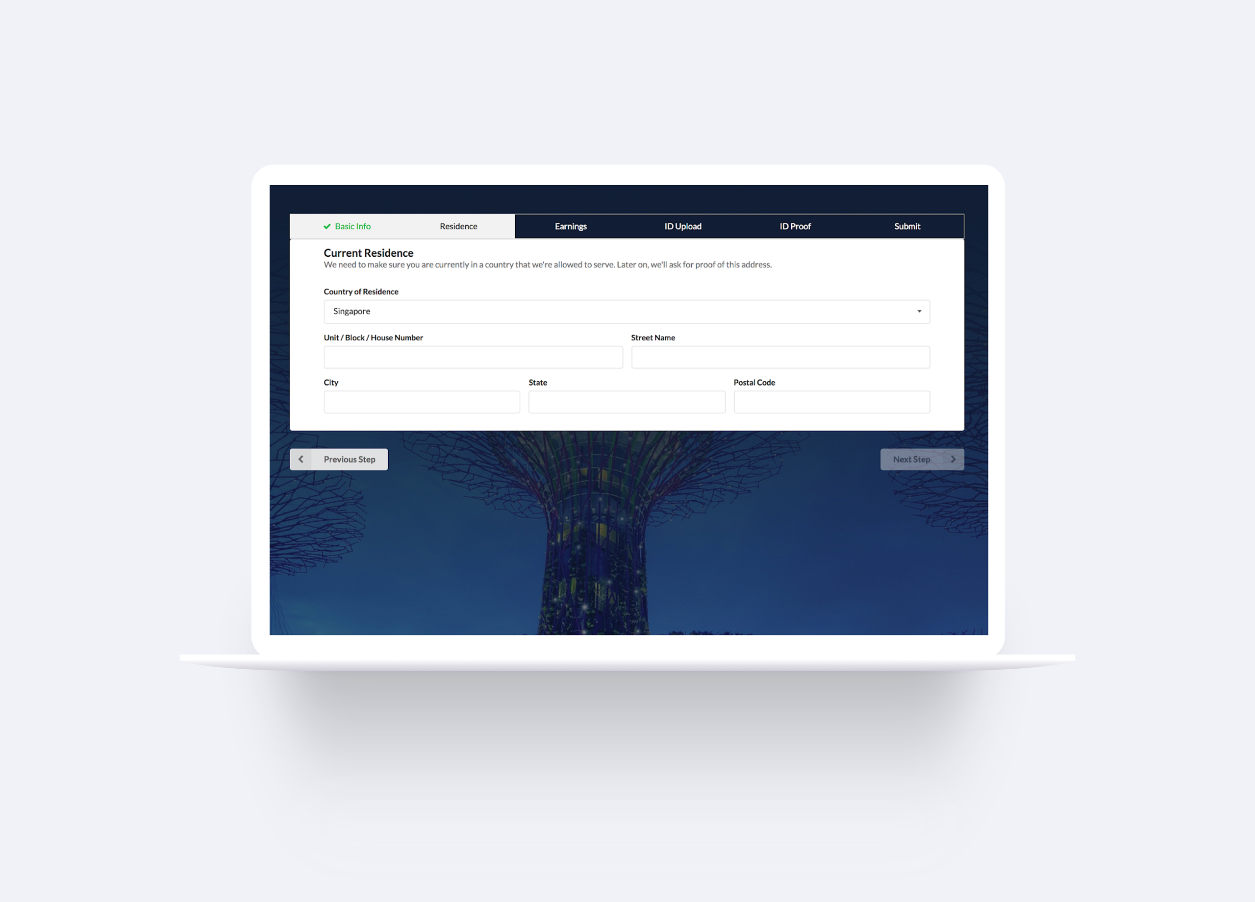
New KYC Process
We restructured the entire KYC process in 3 steps, making it easier for the user to go through each step, providing user retention and contributing to a more organized and consistent UI design.
New KYC Process
We restructured the entire KYC process in 3 steps, making it easier for the user to go through each step, providing user retention and contributing to a more organized and consistent UI design.
New KYC Process
We restructured the entire KYC process in 3 steps, making it easier for the user to go through each step, providing user retention and contributing to a more organized and consistent UI design.
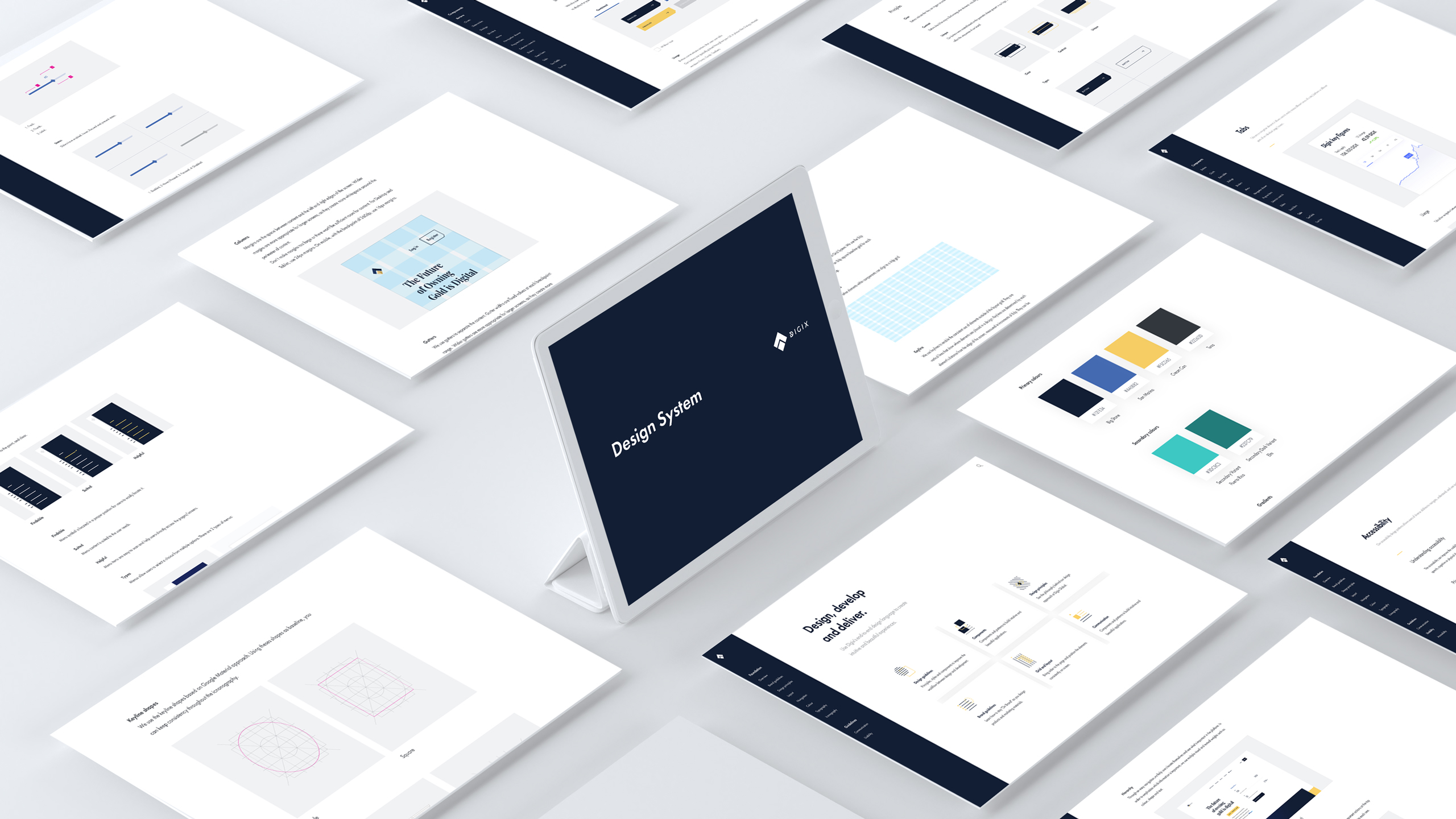
Design System
While the research was in progress and we were collecting all the findings, I started working on the Design System, starting with the Pattern Library, a library of user interface patterns and later evolving to the Design System.
Design System
While the research was in progress and we were collecting all the findings, I started working on the Design System, starting with the Pattern Library, a library of user interface patterns and later evolving to the Design System.