PORTO SEGURO - SUPER APP
PORTO APP
Credit Card Payment flow for Porto
A brand new app for a Insurance Company
A brand new app for a Insurance Company
Project overview
The Porto Seguro’s "Super App," was created for the Brazil's largest insurance company. The app brought together services like insurance and financial solutions in one place. My focus was on the Credit Card Payment flow, helping integrate Pix (instant payment) for a smoother user experience.
My Role
As the Senior UX/UI Designer on the project, I collaborated cross-functionally with product managers, devs, data analysts, and fellow designers to strike the right balance between usability, business priorities, and technical constraints. The redesigned app went live globally in February 2022.
My Role
I worked as UI Design Specialist, helping the UX Design Team from discovery to deliver phase for the new home and credit card experience between November 2020 and May 2021. I also collaborated with other product designers on the entire app and other new features.
Additionally I worked on a new design system to help the teams to elevate, bring more consistency and efficiency to the flows.
The app will be launched globally on February, 2022.
Basics
Product Design Lead: Rodrigo Stevan
UX Design Lead: Johnny Leung
Senior UX/UI Designer: Fabricio Goes
UI Designer: Bruno Franco
Achievements
•Task completion ↑ 75% with more users completed
their payments
• Time on task ↓ 30% with less friction
• Support tickets dropped significantly
• Payment conversion rates improved post-launch
Basics
Product Design Lead. Rodrigo Stevan
UX Design Lead, Johnny Leung
UI Design Specialist: Fabricio Goes
UI Designer: Bruno Franco
Basics
Product Design Lead: Rodrigo Stevan
UX Design Lead: Johnny Leung
UI Design Specialist: Fabricio Goes
UI Designer: Valcir Pacculo
UI Designer: Bruno Franco
The Problem
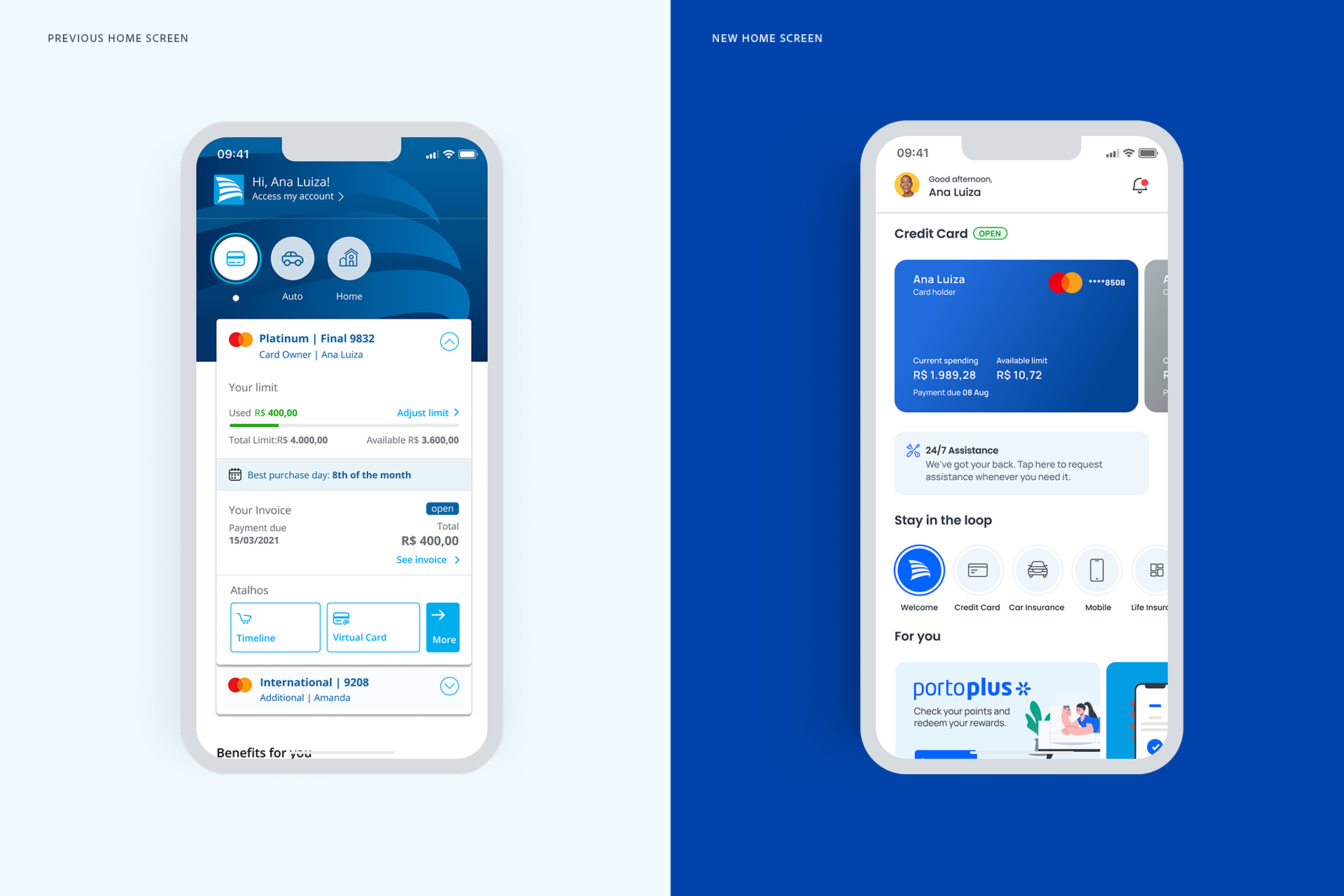
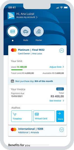
Porto’s credit card flow wasn’t just cluttered, it was losing users. The home screen felt chaotic, key info was buried, and people didn’t trust they were paying the right amount. Confusion led to drop-offs, support calls, and lost revenue.
The challenge: Turn a frustrating experience into one that feels fast, clear, and confident.
The Goal
Design a clear, intuitive credit card payment flow that reduces user friction, increases task completion rates, and minimizes drop-offs, ultimately driving faster payment completions and improving business conversion metrics.
Concept refinement - The Beginning
The original premise was simple: tap a card, get straight to the service. However, we weren't trying to revert to a simple past.
Our ambitions were to create a strong foundation that embraced a rapidly evolving payment process.
In the beginning, the idea was to find out if customers were using and finding credit card information properly. Some doubts arose.
- Are clients enjoying the current home experience on the app?
- Are clients being receptive for a new home on the app?
- Are clients being able to access the card easily?
Here are the methods we used to find answers.
Concept refinement - The Beginning
The original premise was simple: tap a card, get straight to the service. However, we weren't trying to revert to a simple past.
Our ambitions were to create a strong foundation that embraced a rapidly evolving payment process.
In the beginning, the idea was to find out if customers were using and finding credit card information properly. Some doubts arose.
- Are clients enjoying the current home experience on the app?
- Are clients being receptive for a new home on the app?
- Are clients being able to access the card flow easily?
Here are the methods we used to find answers.
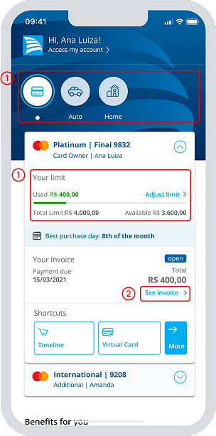
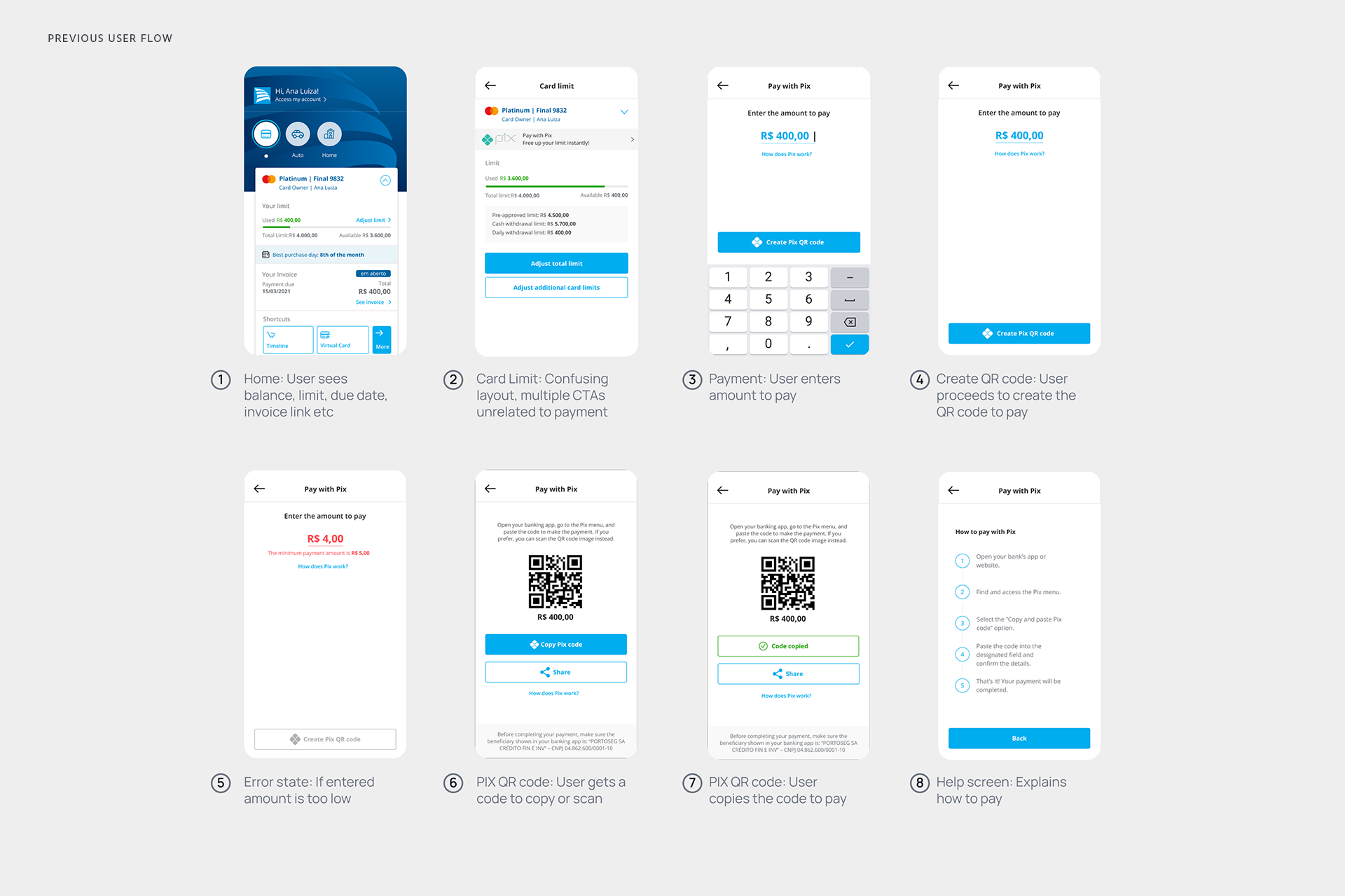
Observed frictions points
- Visual clutter and weak hierarchy made it hard for users to focus or feel confident (1)
- Key actions like “See Invoice” were buried and easy to miss (2)
- Many users hesitated or dropped off during the payment flow
- Support teams were constantly fielding “How do I pay?”
How we spotted the friction
- Early user feedback made the frustration loud and clear
- Analytics (via Firebase) showed drop-offs mid-payment
- Our UX audit flagged poor hierarchy and cluttered layout
- Support tickets echoed confusion on how and where to pay
UX Interviews
To answer these questions, we interviewed numerous people that were currently using the app.
This gave us a solid basis to understand:
a) their attitudes to access their credit card
b) their methods for managing and paying their credit card
Our Hyphotesys
If we simplify the credit card screen, declutter the layout, and elevate key actions visually, users will navigate the flow more confidently and efficiently, resulting in higher task completion rates and fewer drop-offs.
“I need to find a flexible solution/app that's simple and effective, helping me to optimize my time while dedicating myself for other subjects.”
— Isabel Teixeira
“”I need to find a flexible solution/app that's simple and effective, helping me to optimize my time while dedicating myself for other subjects.”
— Isabel Teixeira
What we needed to understand
• What customers truly expected when making a payment
• The biggest blockers and pain points in the current flow
• How they felt about finding credit card info from the home screen
• What a stress-free payment experience looked like in their eyes
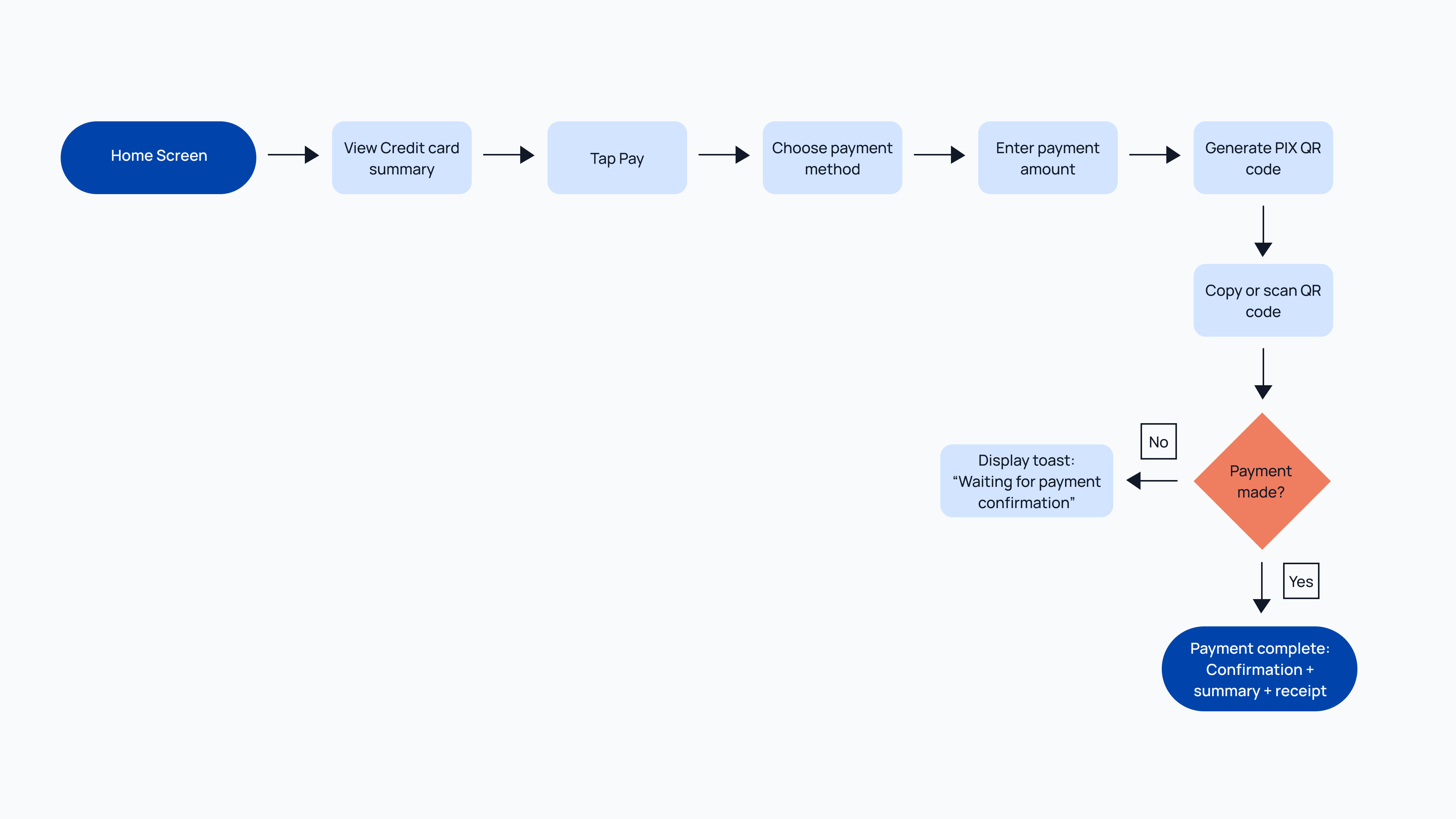
Mapping the Credit Card Payment Experience
The Add App flow was part of a bigger experience, so I started by mapping all those pieces. This was important since what the user sees is highly dependent upon different statuses—including whether or not the user has conversion tracking (MACT) and deep links set up.
How we dived deeper?
- Ran focus groups to get first impressions
- Conducted competitive benchmarking to learn best practices from market leaders
- Held 10 user inteviews to dig into real behaviours, expectations, and ”hidden pain points”
- We did an ”UX review” to identify obvious usability gaps early
Insights from user interviews
- Users prioritized speed and simplicity above all
- Cluttered screens caused hesitation and second-guessing
- Clear, prominent actions built trust and helped them move forward
- No confirmation after payment left users unsure if it even went through
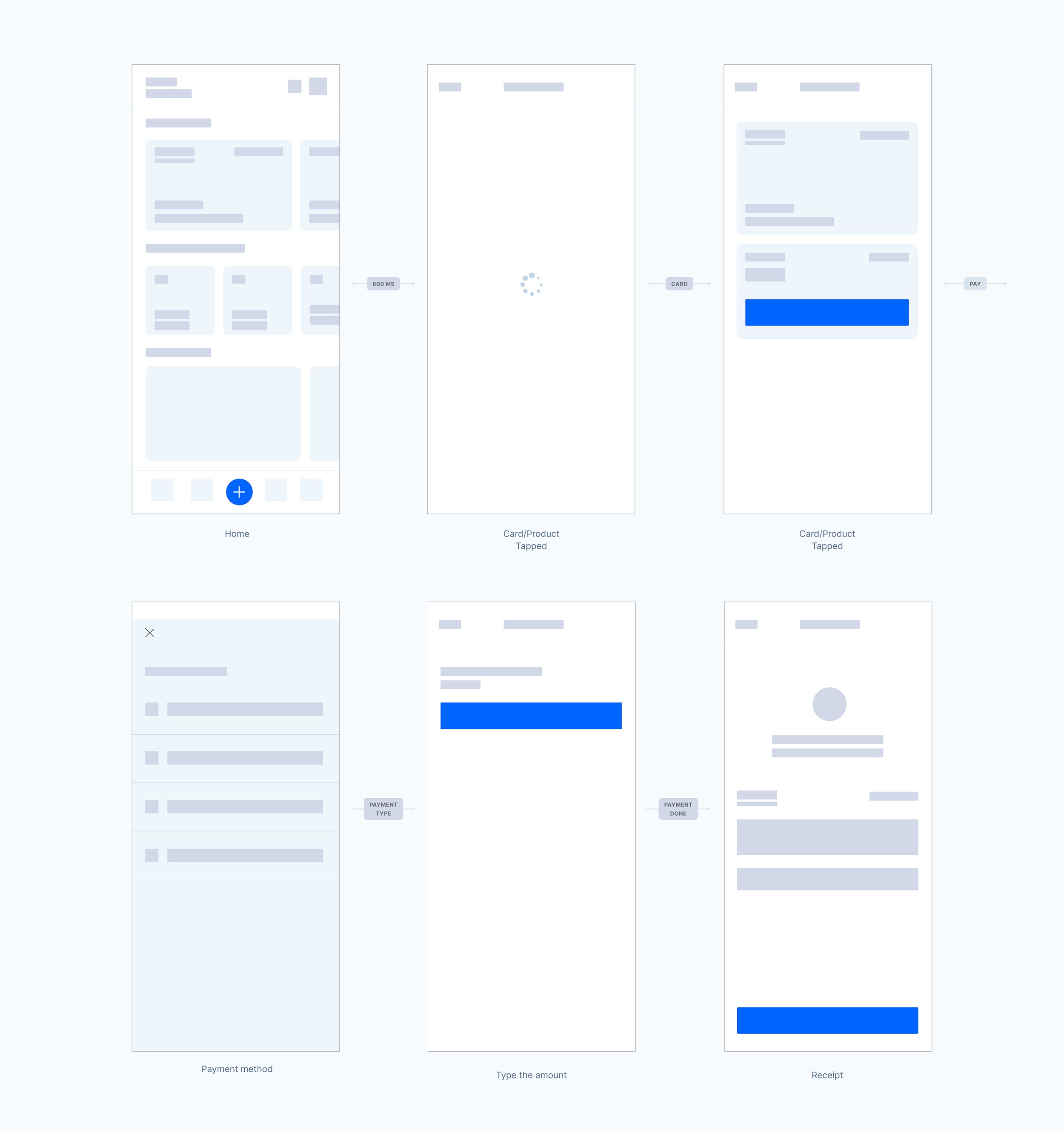
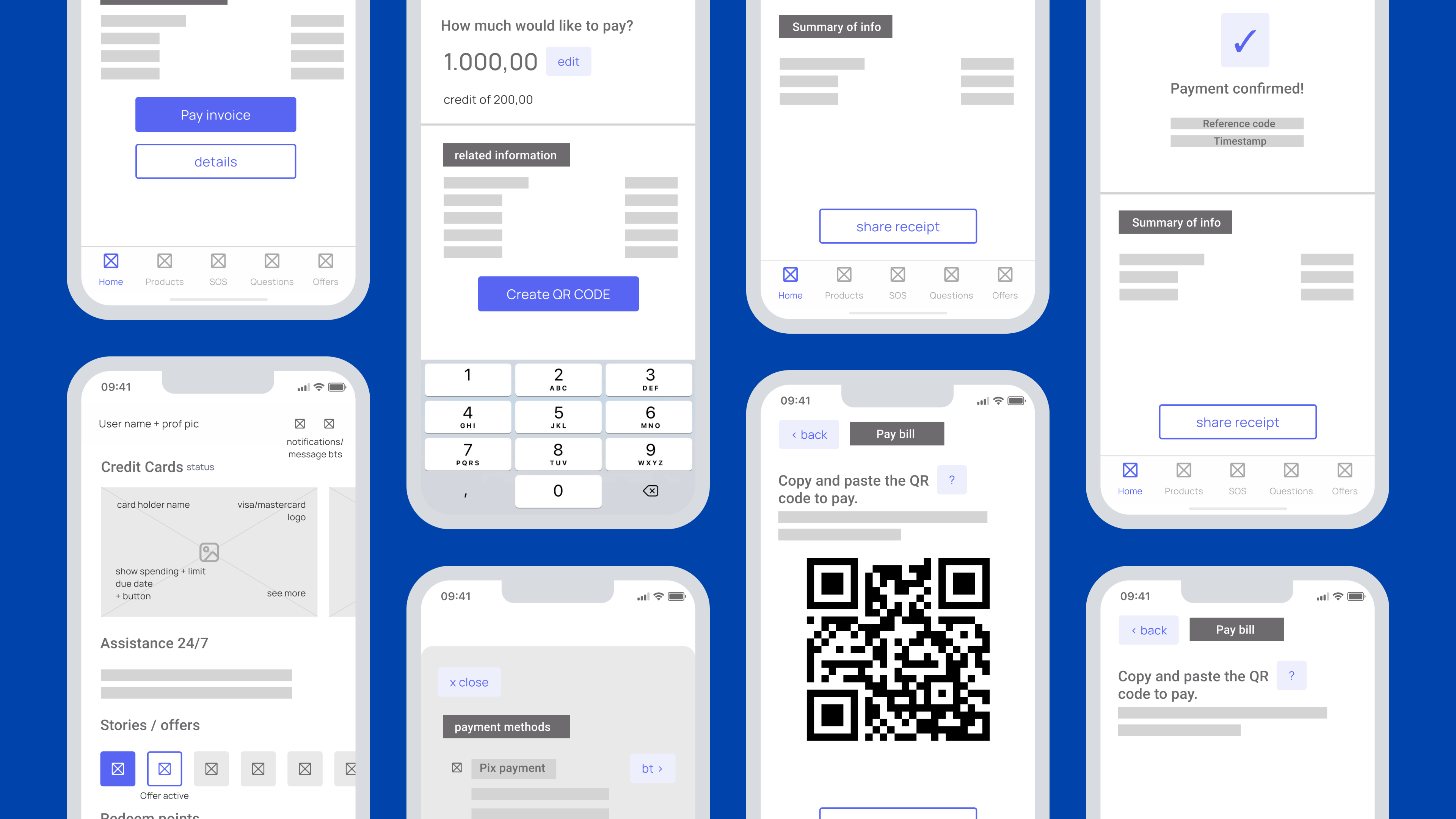
Wireframes
Here are the wireframes that we designed, considering the research, interviews and user flow.
Wireframes
Here are the wireframes that we designed, considering the research, interviews and user flow.
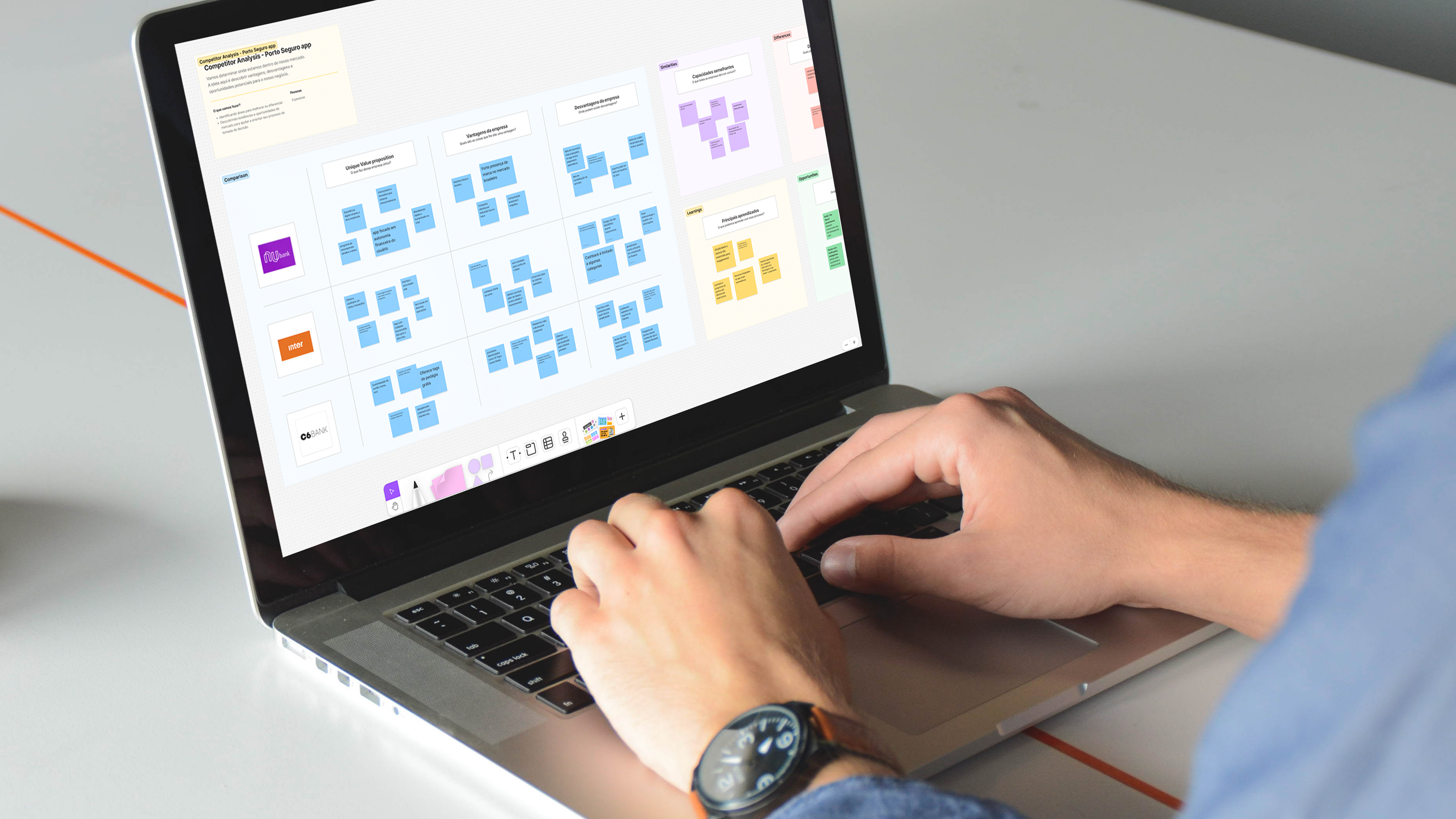
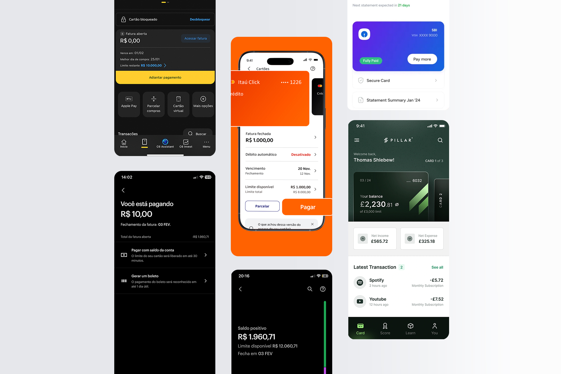
Competitor Analysis - Take-aways
To shape a a better payment experience, we looked at how other financial apps were solving similar problems. We focused on layout patterns, clarity of information, and how they guided users through the flow, especially when it came to payments and confirmations. This helped us identify best practices we could adapt and gaps we needed to close:
- A prominent, large payment card made flows feel faster and more intuitive
- Clean, simplified layouts helped reduce cognitive load
- Clear payment options + confirmation modals set expectations and eased post-payment uncertainty
High Fidelity Prototypes
Here we aimed more towards being pixel- perfect of the final product, also considering the new colours and typography.
High Fidelity Prototypes
Here we aimed more towards being pixel- perfect of the final product, also considering the new colours and typography.
Top themes uncovered
Across user interviews, research, and UX analysis, a few patterns stood out. The interface lacked visual hierarchy, which made it hard for users to know where to focus, leading to hesitation and drop-offs. Important details like amounts, due dates, and payment status weren’t easily visible, creating confusion. Then the top themes we uncovered were:
- Weak visual hierarchy → users hesitated and dropped off
- Key info wasn’t visible enough → caused confusion about amounts, due dates, and status
- Steps and system feedback lacked clarity → lowered confidence in completing payments
Iterations for the new Onboarding and Home
As we were evolving with the payment flow, we prioritized some time to iterate new ideas for the home.
Iterations for the new Onboarding and Home
As we were evolving with the payment flow, we prioritized some time to iterate new ideas for the home.
From concepts to confident payments
Once we had a clear picture of what users needed, we moved into ideation. The goal was to simplify the journey and boost clarity without adding friction, so we kept things lean, and feedback-driven from the start.
- Mapped the user flow and sketched low-fi ideas focused on hierarchy
- Tested early concepts with 10 users → rapid feedback loops
- Co-created with devs & product to ensure feasibility from day one
Iterations for the new Onboarding and Home
As we were evolving with the payment flow, we prioritized some time to iterate new ideas for the home.
Iterations for the new Onboarding and Home
As we were evolving with the payment flow, we prioritized some time to iterate new ideas for the home.
What we tested and why it mattered?
Based on user feedback received, we redesigned the credit card payment screen to remove clutter, improve focus, and create a clearer path to action. We conducted usability testing with 10 participants, ensuring we covered a good mix of user profiles. This allowed us to identify recurring pain points and validate key design decisions. We focused on key tasks like accessing credit card details and paying invoices.
After several meetings with stakeholders, including Product Designers, UI Designers, Architects, Researchers, Writers, Developers, Accessibility Specialists, Design Leads, Squad Leaders and Product Owners, we started an inventory of the UI, tabulating all inconsistency data according to the team feedback.
After that we create a deck with a the roadmap and other informations regarding the timeline. We also created a Design System Ambassadors program: a centralized team model that develops and maintains a Design System with a group of people dedicated part-time or full-time. Basically a Product Designer + an Architect from each Squad were responsible for bringing the Design System updates to their squad in order to have efficiency.
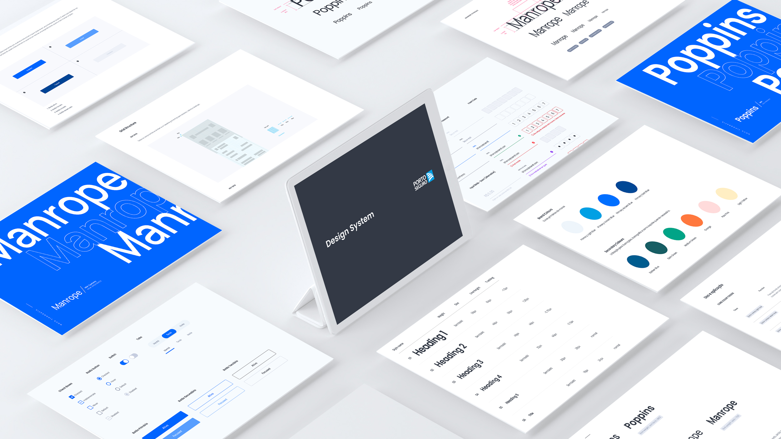
Through a consistent Pattern Library and visual language system aligned with accessibility, we worked on the complete documentation for each component, which we made available on the Zero Height platform.
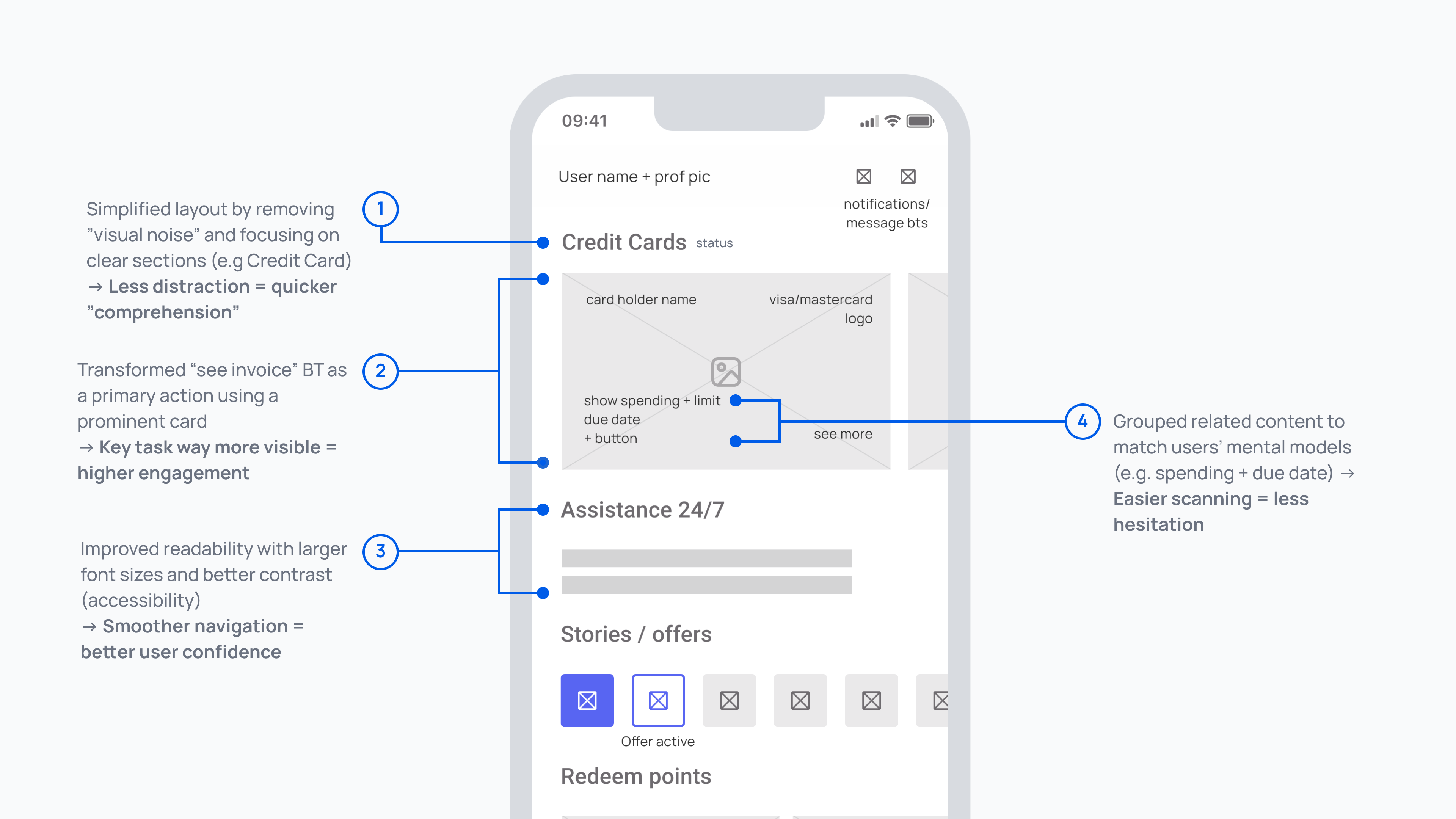
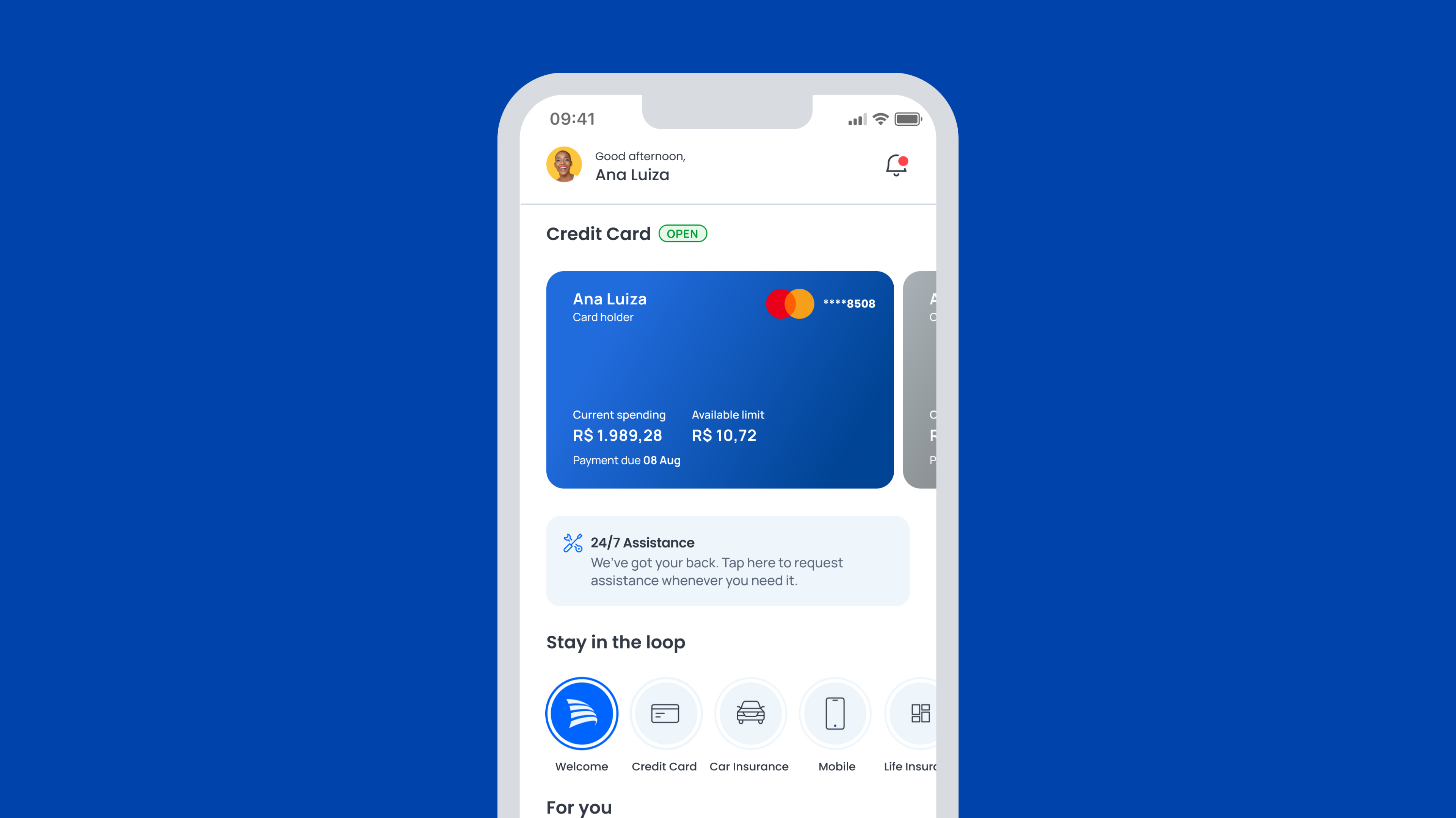
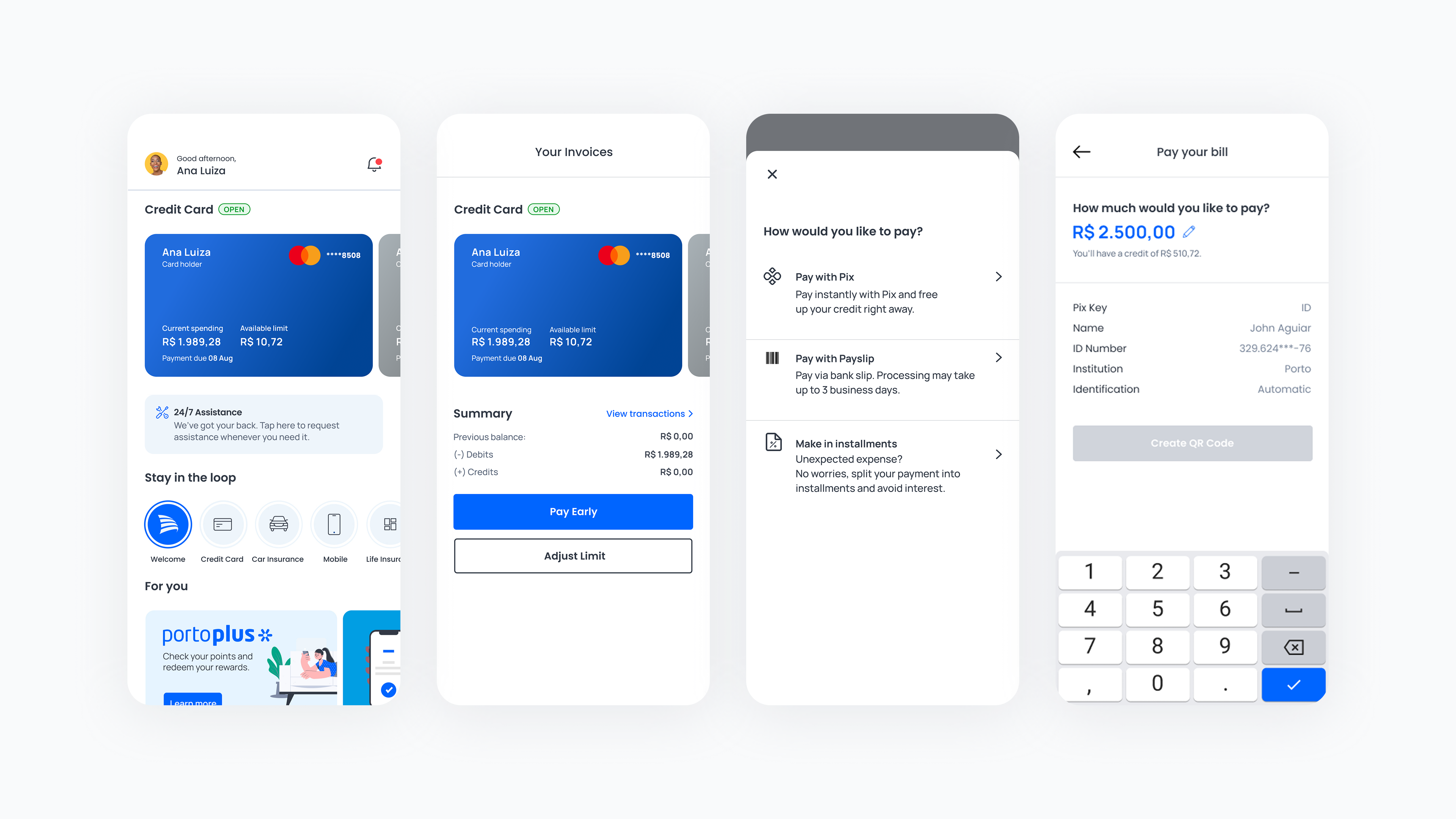
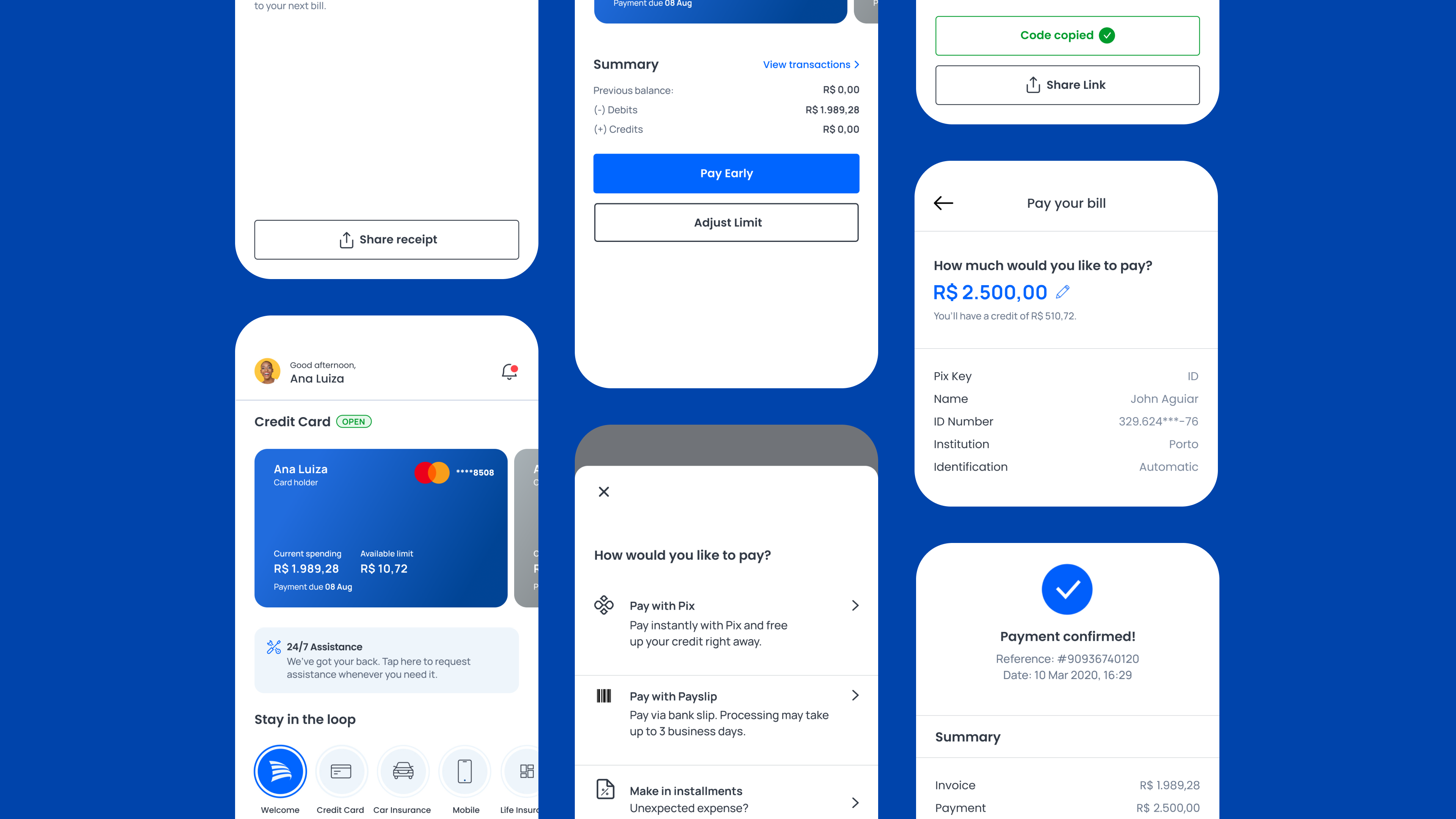
What the final experience looked like
The new experience brought clarity and focus. We redesigned the landing screen to surface the most important payment info right up top. A large, touch-friendly card became the key CTA (the so called "the card" by our team). It's visually dominant and easy to act on. We also applied the new design system throughout for consistency and scalability. The result: a smoother, more intuitive flow that gave users confidence and reduced mistakes.
After several meetings with stakeholders, including Product Designers, UI Designers, Architects, Researchers, Writers, Developers, Accessibility Specialists, Design Leads, Squad Leaders and Product Owners, we started an inventory of the UI, tabulating all inconsistency data according to the team feedback.
After that we create a deck with a the roadmap and other informations regarding the timeline. We also created a Design System Ambassadors program: a centralized team model that develops and maintains a Design System with a group of people dedicated part-time or full-time. Basically a Product Designer + an Architect from each Squad were responsible for bringing the Design System updates to their squad in order to have efficiency.
Through a consistent Pattern Library and visual language system aligned with accessibility, we worked on the complete documentation for each component, which we made available on the Zero Height platform.

Rolling it out
We partnered closely with the dev team to roll out the flow using componentized layouts, which made handoff smoother and updates easier. We also covered edge cases like errors and loading states early on to avoid tech debt down the line. The new design system ensured visual consistency and long-term scalability.
One challenge? The large card layout initially got some pushback, but we solved it through A/B test results and visual demos that clearly showed the user and business impact.
After several meetings with stakeholders, including Product Designers, UI Designers, Architects, Researchers, Writers, Developers, Accessibility Specialists, Design Leads, Squad Leaders and Product Owners, we started an inventory of the UI, tabulating all inconsistency data according to the team feedback.
After that we create a deck with a the roadmap and other informations regarding the timeline. We also created a Design System Ambassadors program: a centralized team model that develops and maintains a Design System with a group of people dedicated part-time or full-time. Basically a Product Designer + an Architect from each Squad were responsible for bringing the Design System updates to their squad in order to have efficiency.
Through a consistent Pattern Library and visual language system aligned with accessibility, we worked on the complete documentation for each component, which we made available on the Zero Height platform.
How we measured success
- Task completion rate ↑ 75% → more users successfully paid their bills
- Time on task ↓ 30% → faster flow = less friction
- Support tickets dropped → fewer complaints = clearer experience
- Usability testing confirmed clarity + confidence → users found the flow easier to follow
- Payment conversion rate increased → more users completed the journey end-to-end!
- Post-launch analytics backed us up → we saw clear improvement in funnel performance
After several meetings with stakeholders, including Product Designers, UI Designers, Architects, Researchers, Writers, Developers, Accessibility Specialists, Design Leads, Squad Leaders and Product Owners, we started an inventory of the UI, tabulating all inconsistency data according to the team feedback.
After that we create a deck with a the roadmap and other informations regarding the timeline. We also created a Design System Ambassadors program: a centralized team model that develops and maintains a Design System with a group of people dedicated part-time or full-time. Basically a Product Designer + an Architect from each Squad were responsible for bringing the Design System updates to their squad in order to have efficiency.
Through a consistent Pattern Library and visual language system aligned with accessibility, we worked on the complete documentation for each component, which we made available on the Zero Height platform.