RIDERIZE APP
RIDERIZE APP
Biker app that connects bikers and give prizes
Biker app that connects bikers and give prizes
Biker app that connects bikers and give prizes
My Role
I worked as Product/UI Designer, helping the UX Design team and leading the UI Design Team to build a great and pleasurable experience throught the challenges and prizes.
In addition, I worked alongside a UX Design Lead and a Product Manager.
My Role
I worked as Product/UI Designer, helping the UX Design team and leading the UI Design Team to build a great and pleasurable experience throught the challenges and prizes.
In addition, I worked alongside a UX Design Lead and a Product Manager.
Basics
UX/UI Designer: Fabricio Goes
UX Design Lead: Max Omig
Product Manager: Fabricio Cantareira
Basics
UX/UI Designer: Fabricio Goes
UX Design Lead: Max Omig
Product Manager: Fabricio Cantareira
Goal
The app didn't have a good aesthetic design and the usability was outdated. The goal was the redesign the Home screen, as well as the internal challenge screen in a clear, concise and consistent way.
Make it fast and easy to use for bikers, everywhere.
Give bikers more control over their challenges.
Create a app for innovation and deeper engagement.
My Role
I worked as Product/UI Designer, helping the UX Design team and leading the UI Design Team to build a great and pleasurable experience throught the challenges and prizes.
In addition, I worked alongside a UX Design Lead and a Product Manager.
Achievements
• User engagement: The app has achieved a 30% increase in daily active users by integrating a system that rewards physical activity with points that can be redeemed for cash.
• Significant health impact: Users collectively earned over $1 million through the app's rewards gamification system.
• Total downloads: The app has been downloaded approximately 12,000 times since its launch in 2023, demonstrating a growing user base.
Basics
UX/UI Designer: Fabricio Goes
UX Design Lead: Max Omig
Product Manager: Fabricio Cantareira
Conducting research and synthesizing results to uncover painpoints and user needs
In what context do cyclists like taking challenges to get prizers? How do they imagine that? What problems do they have with this while participating in challenges?
To find answers, we conducted 8 interviews with all types of people from the target audience (ranging from cyclist to professional cyclist), observed people who were using similar apps, and learned a lot from in-depth research like looking into competitors, other cycling app tools, etc.
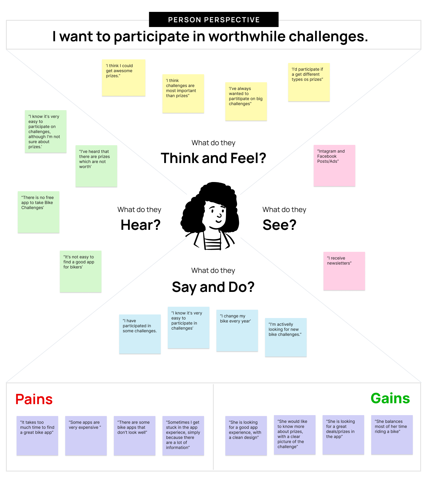
By synthesizing the results using the empathy map, we were able to discover our target audience's values and learn about their problems with participating in challenges and using cycling apps.
Conducting research and synthesizing results
to uncover painpoints and user needs
In what context do cyclists like taking challenges to get prizers? How do they imagine that? What problems do they have with this while participating in challenges?
To find answers, we conducted 8 interviews with all types of people from the target audience (ranging from cyclist to professional cyclist), observed people who were using similar apps, and learned a lot from in-depth research like looking into competitors, other cycling app tools, etc.
By synthesizing the results using the empathy map, we were able to discover our target audience's values and learn about their problems with participating in challenges and using cycling apps.
The current state as a starting point
The cyclist is in more and more places where the app doesn't work properly and the user experience wasn't good enough in the past to provide clear information on the challenges. Furthermore, the previous app lacked structuring of elements and a coherent visual foundation.
With this panorama, we approached some points of attention:
1. Lack of focus on the experience as a whole
The way the challenges were structured was confused in the UI and made the app difficult to use. The user couldn't get into the flow while concentrating on thinking about the structure or the content.
2. Lack of visual patterns
The previous app lacked foundational standards such as color palette, typography and spacing. For this, we created the styleguide with all the UI guidelines.
3. Lack of accuracy in viewing Challenges on the Home Screen
The elements in Home Screen were not well structured in relation to the hierarchy of information and elements.
Cross-disciplinary ideation session
I ran an ideation session based on my research results with the help of a cross-disciplinary team to create first concepts. We started out brainstorming different solutions for the home and combining the ideas together using Miro. Below we have the blockframes of each direction.
Solutions went from having working templates and using a mobile device purely as a CMS, to building a sort of layer-system, building a breakpoint-editor, writing Markdown and seeing results take form in a sort of preview window we all used back in the Photoshop days.
Creating guidelines to find our decision
To benchmark great ideas, I worked on a set of Design Criteria, based on IDEO's method. They described the most important points of the solution and gave a clear direction of what needed to be created. After that, in the design process, they really helped me to make tough decisions quicker.
Go with flow
You help you to focus and discover the best challenges with great brands.
Work with confidence
We give you the self-confidence, with the best challenges and a clear picture of your route.
Have the right of power
We help you to find the best bike challenges, shape and share your ideas by posting comments and adding friends.
Personal updates
We know the type o challenge you like the most, so that we can offer the best challenges for you.
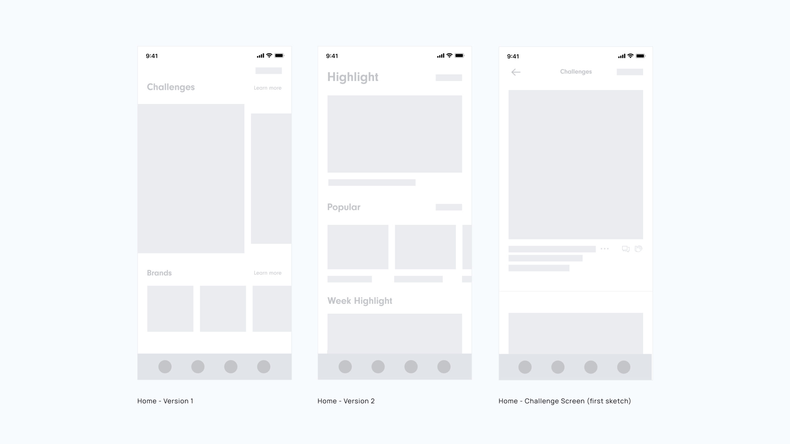
First High fidelity Prototype
Based on the results of the concepting session and the Styleguide, I worked on high-level prototypes for home and challenge screens, using simple elements and wrote short write-ups of the solutions.
First High fidelity Prototype
Based on the results of the concepting session and the Styleguide, I worked on high-level prototypes for home and challenge screens, using simple elements and wrote short write-ups of the solutions.
Testing the first explorations
To learn to what these directions could solve the problem, We went through the first prototypes with several users by using Lookback. We learned that some directions weren't solutions, but combined they could really solve the problem.
- All the participants loved the landscape orientation of the highlighted challenge.
- Despite the challenge's logos, most participants said it was quite small. That gave the opportunity to remove them.
- Some users don't quite understand the challenge filter on the right. This was interesting since I commented in meetings that this filter might not work correctly.
- Despite the challenge branding logos, most participants said it was small.
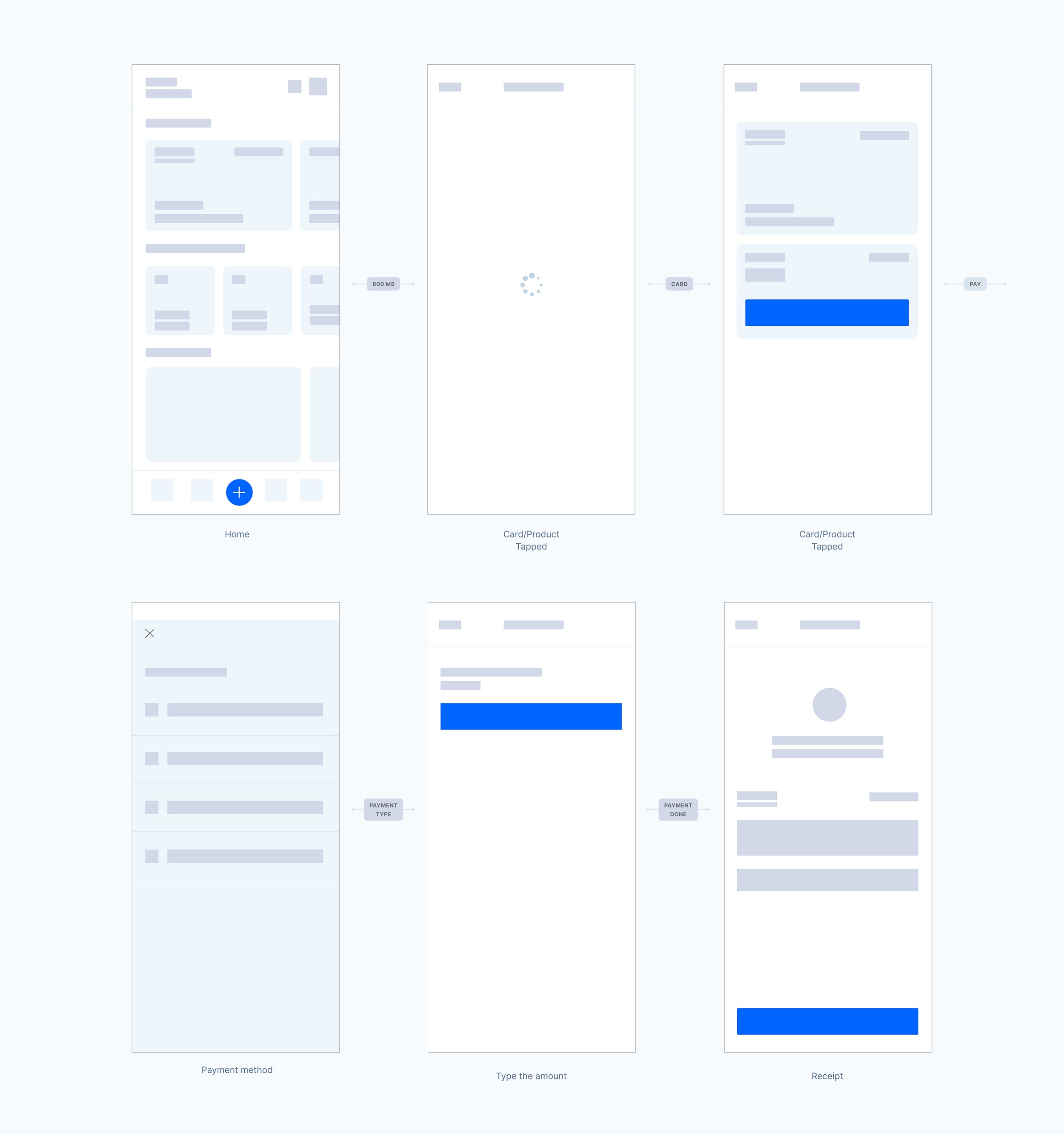
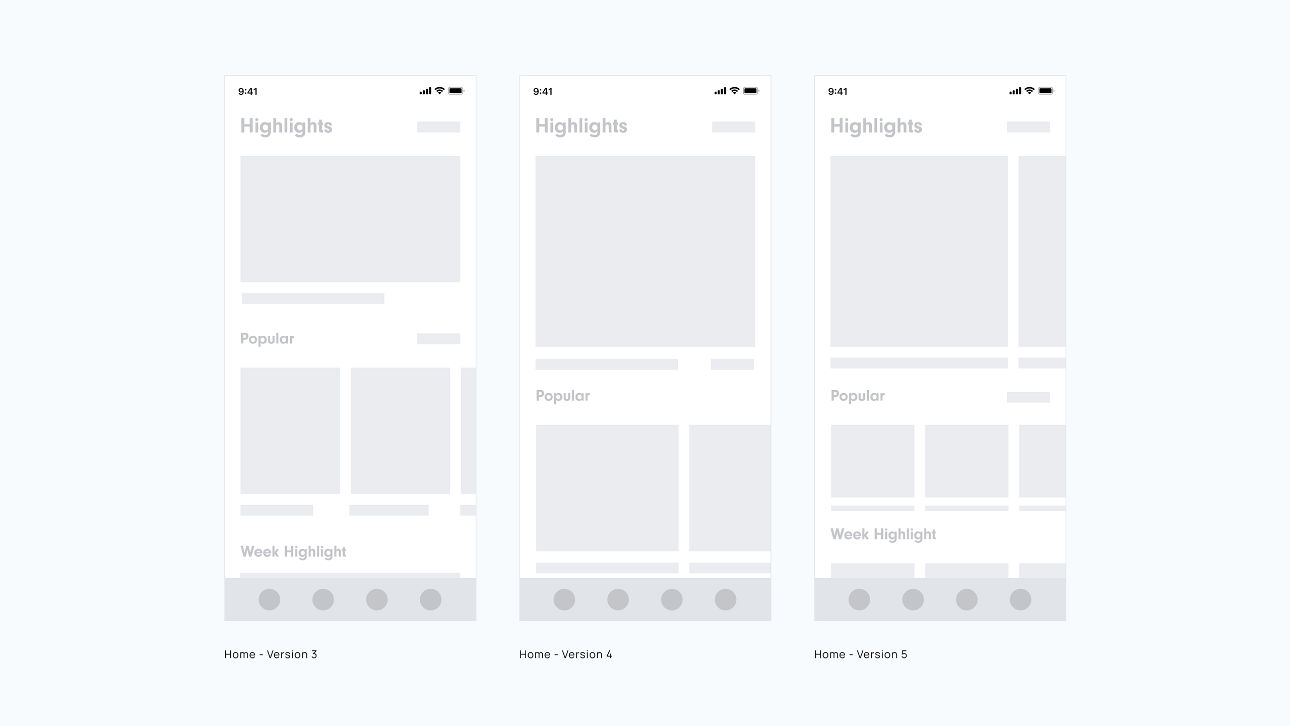
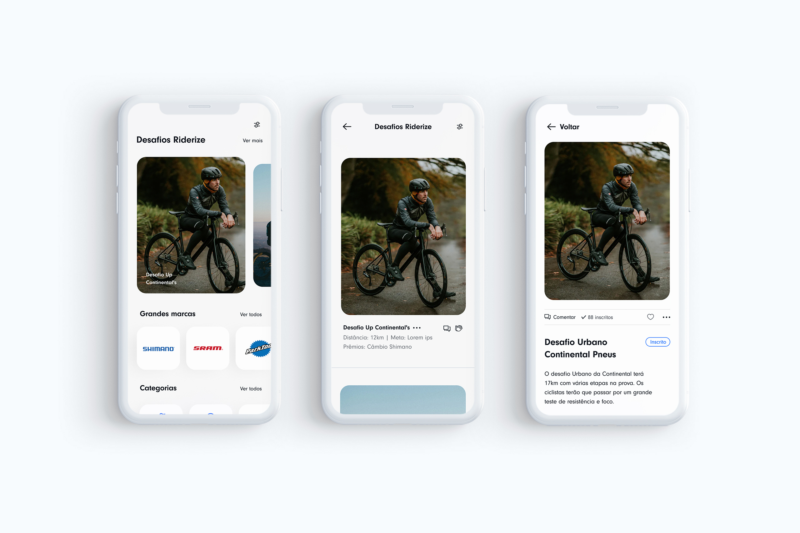
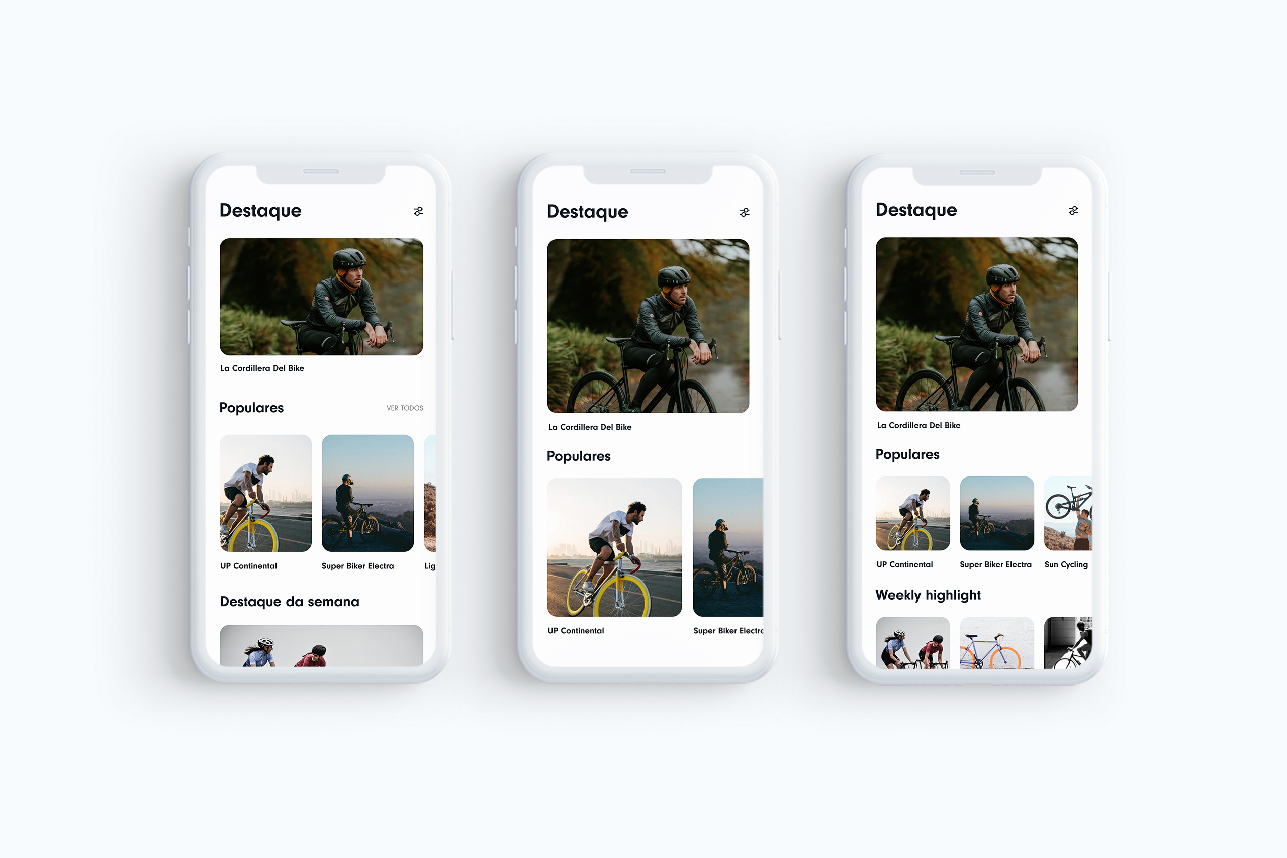
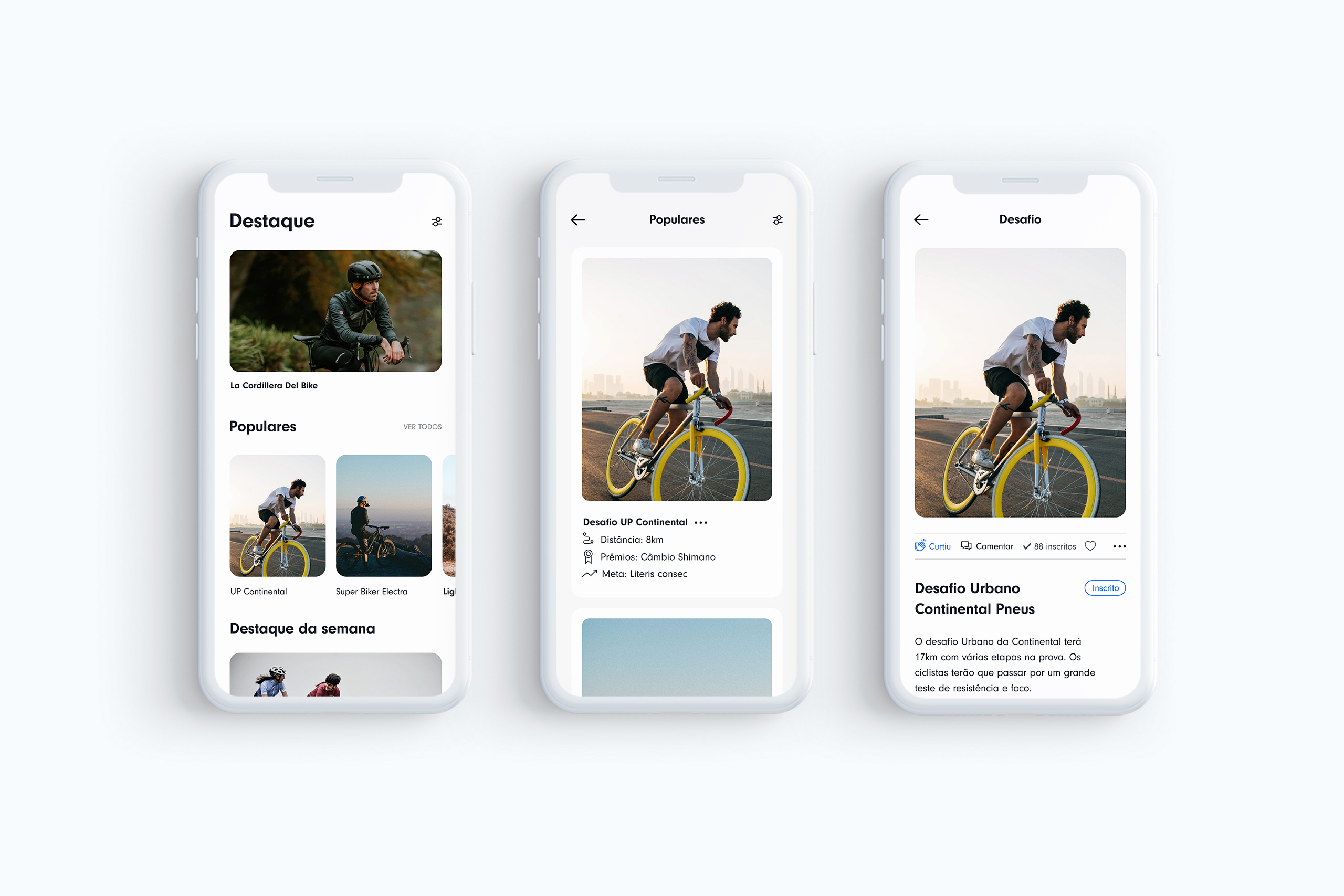
Iteratively prototyping solutions for the new home screen
Based on the test results, I iterated the final design of the home and some internal screens. This brought up a set of interesting points to evolve with.
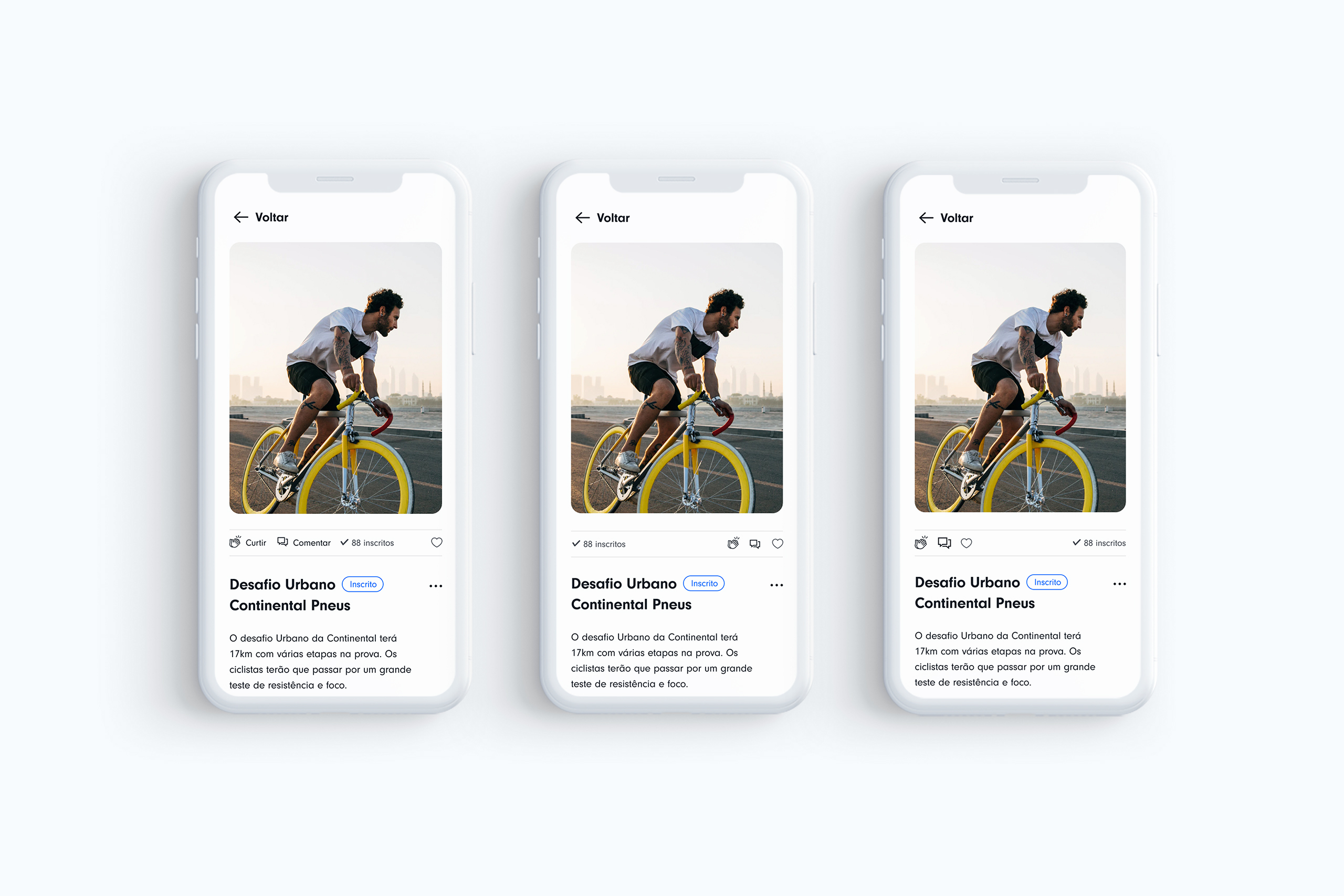
After showing the preliminary home screens in a meeting, the client suggested a couple new features: that each challenge had a mention of how many likes this particular challenge had already. This made me totally rethink the UI Design on the challenge screen, as I had in mind that we wouldn't have any else functionality. So I ended up iterating some options for these components as follows.
Iteratively prototyping and testing core
components to explore solutions
Based on the test results, I iterated the final design of the home and some internal screens. This brought up a set of interesting points to evolve with.
After showing the preliminary screens in a meeting, the client suggested a couple new features: that each challenge had a mention of how many likes this particular challenge had already and the number of subscribers. This made me totally rethink the UI Design on the challenge screen, as I had in mind that we wouldn't have any else functionality. So I ended up iterating a bunch of options for these components.
With this new functionality, it was also necessary to think about the 'Like' 'Comment' buttons and the information on how many subscribers the event had so far.
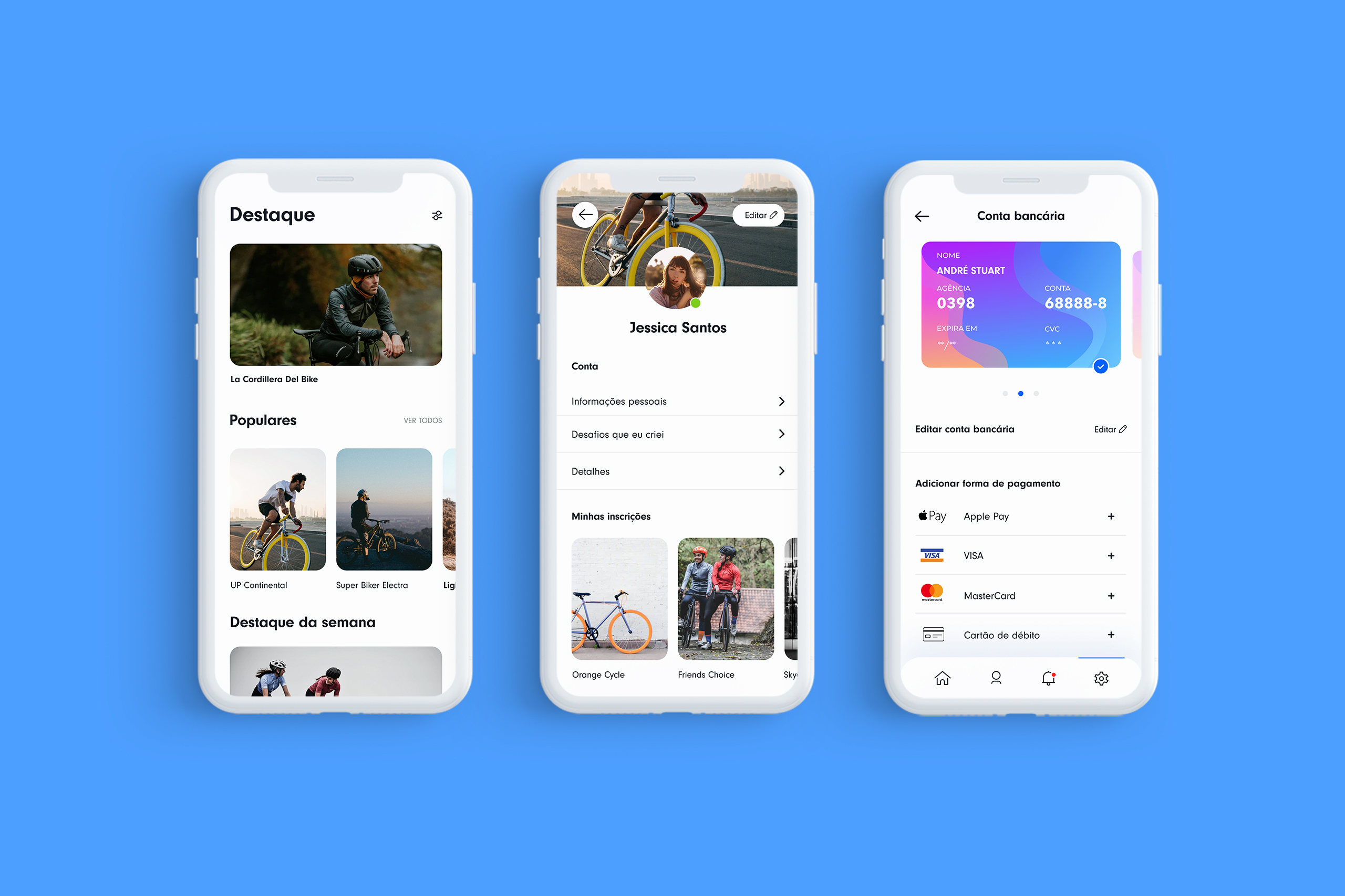
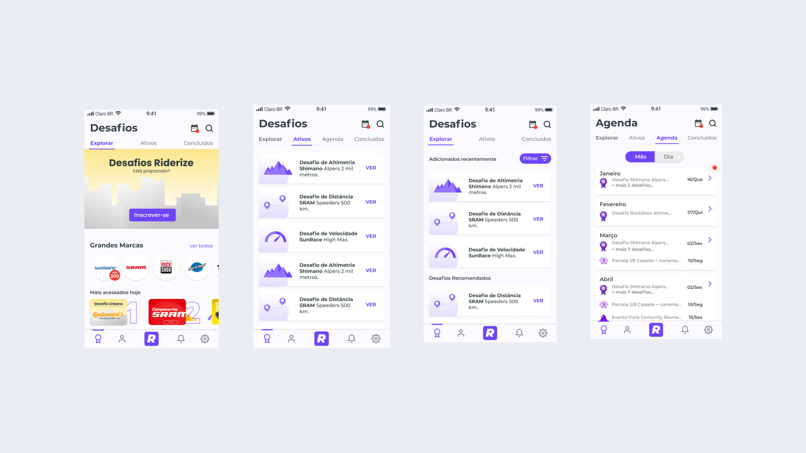
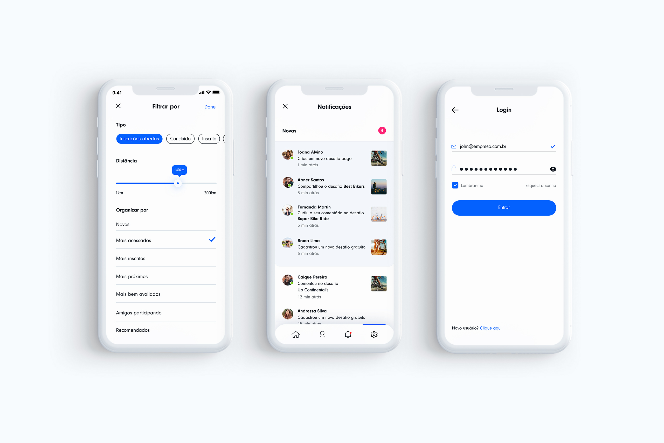
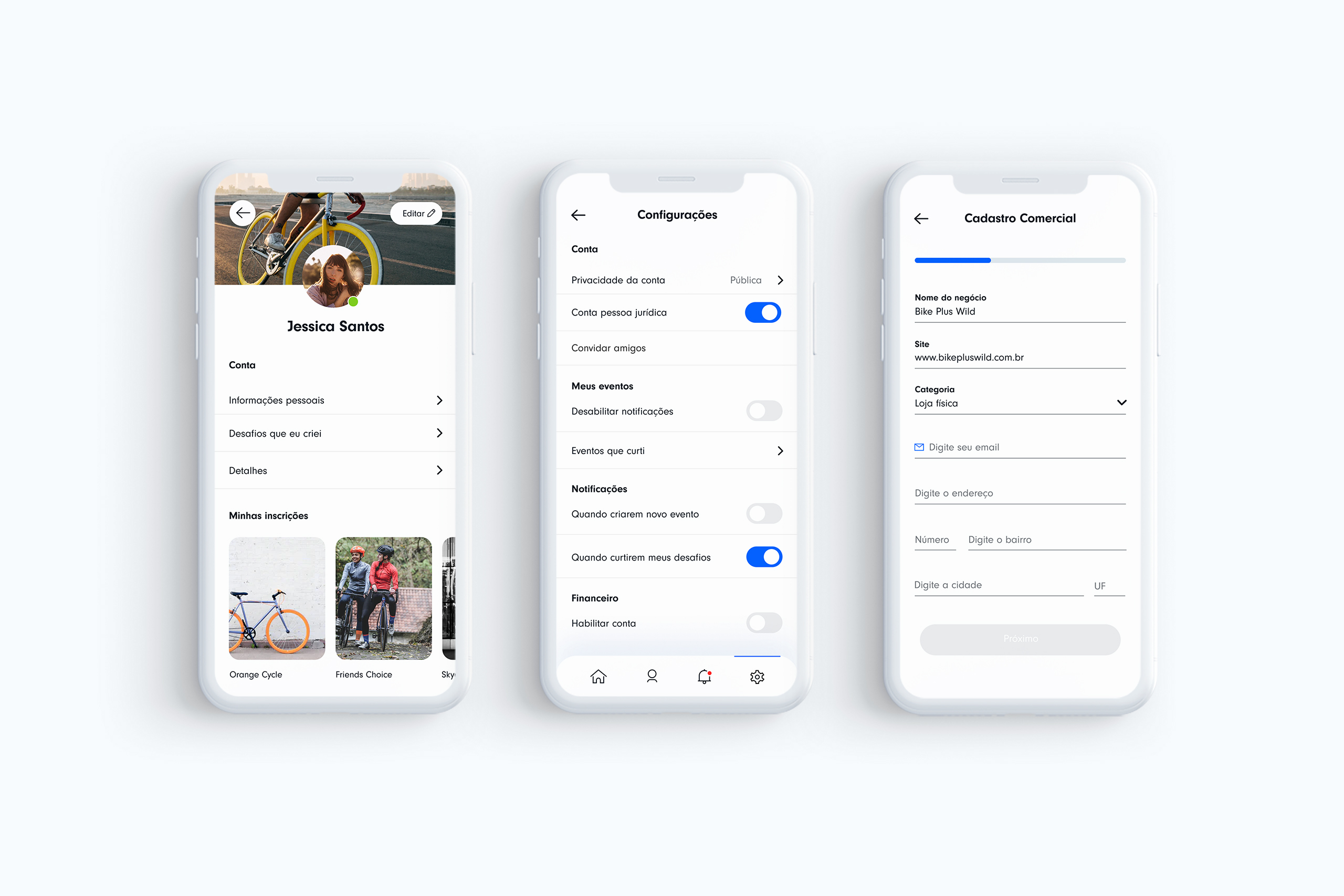
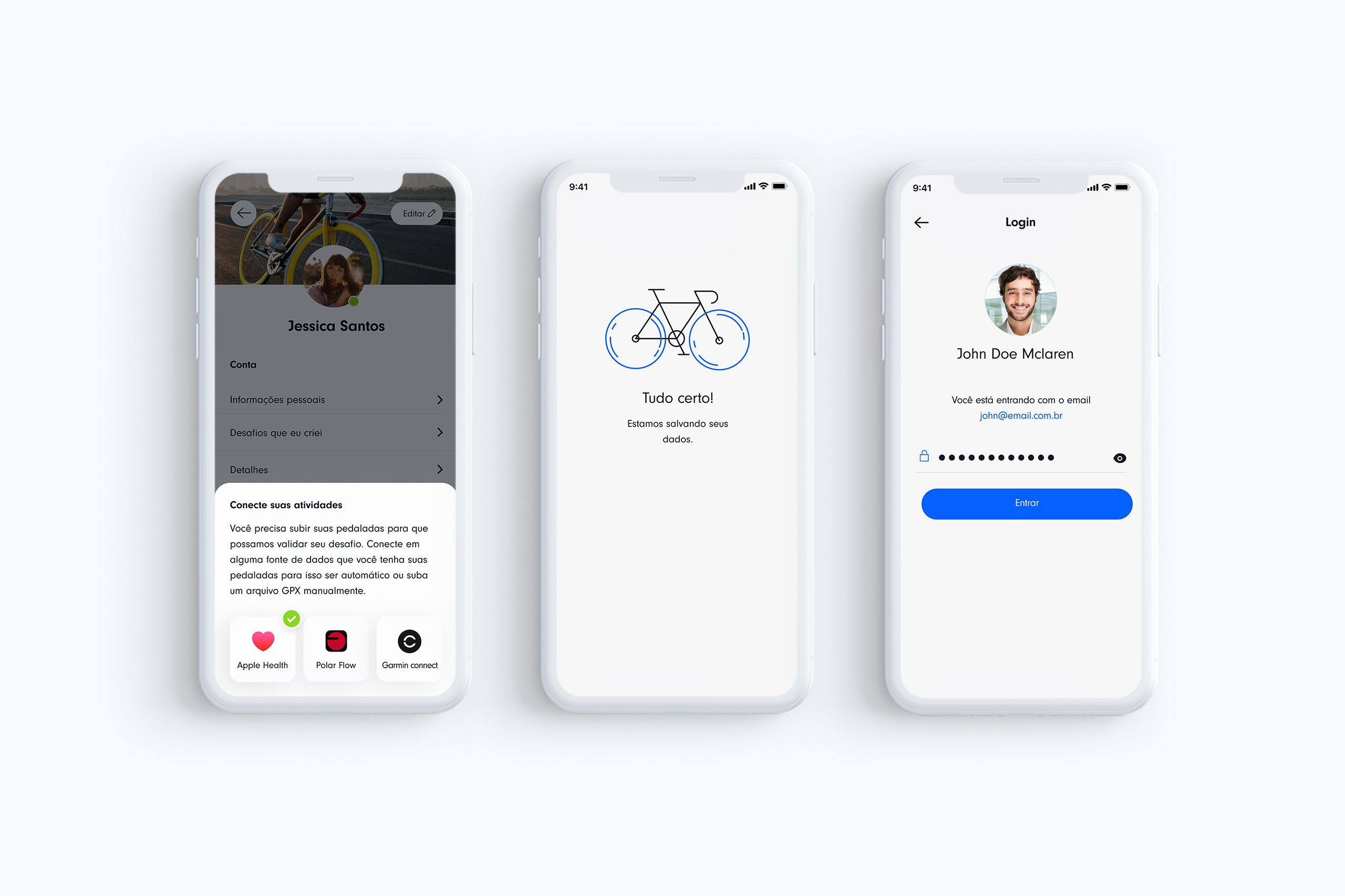
Detailed Designs
As I had approximately 1 month of work for this project, I started iterating other screens in the app, building the styleguide and aligning through meetings with stakeholders. Below are the detailed designs.
Detailed Designs
As I had approximately 1 month of work for this project, I started iterating other screens in the app, building the styleguide and aligning through meetings with stakeholders. Below are the detailed designs.
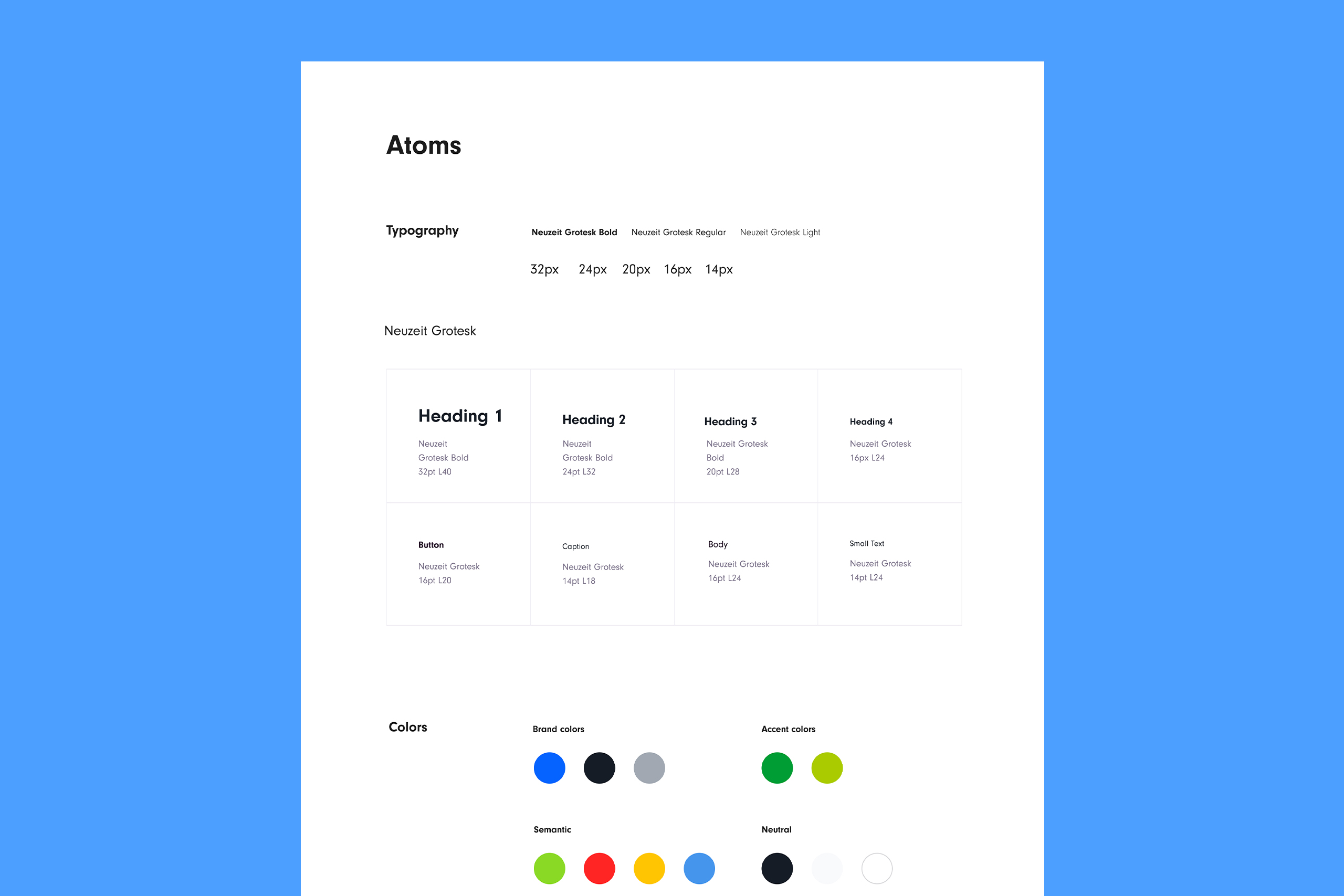
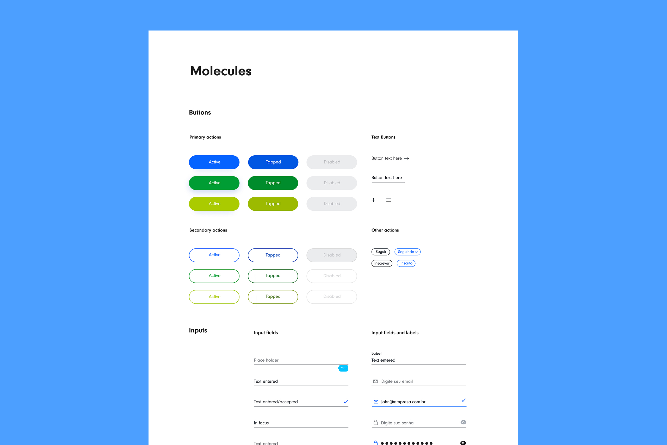
Style Guide
In onder to have consistency through the screens, I worked on the styleguide, using Brad Frost Atomic Design approach, provinding rules, foundations and components to help the team with brand consistency when creating new assets and screens.
Style Guide
In onder to have consistency through the screens, I worked on the styleguide, using Brad Frost Atomic Design approach, provinding rules, foundations and components to help the team with brand consistency when creating new assets and screens.