TREATSURE
TREATSURE
TREATSURE
A new app for a leading food startup
A new app for a leading food startup
A new app for a leading food startup
Project Overview
Treatsure is a platform that connects customers with surplus food to help reduce waste and give restaurants a chance to profit from leftovers. My focus was on designing a user-friendly app that encouraged both customers and restaurants to use it regularly.
My Role
I was part of the pitch team and participated in the experience, strategy, research and UI design of the iOS app. I lead the UI Design work, producing all major screens and I worked alongside a UX Research Lead. Although the experience & design is done, the app is under development.
Basics
UX Research Lead: Heloise Jutteau
Senior Product Designer: Fabricio Goes
Junior UX Designers: Matthias Dirk, Lim Weng
UX Writter: Jian Lou
Basics
UX Research Lead: Heloise Jutteau
Senior Product Designer: Fabricio Goes
My Role
I was part of the product design team and participated in the strategy, and research of the app from Jun 2020 to Feb 2021. I led the UX/UI Design work, producing all major screens and I worked alongside a talented UX Research Lead and a small team of UX Designers.
My Role
I was part of the pitch team and participated in the experience, strategy, research and UI design of the iOS app. I lead the UI Design work, producing all major screens and I worked alongside a UX Research Lead. Although the experience & design is done, the app is under development.
Achievements
• User engagement increased by 25% after 4 months of redesigning the app.
• 2,200 kg of food saved in just 4 months — over 50 tonnes saved since 2017.
Basics
UX Research Lead: Heloise Jutteau
Senior Product Designer: Fabricio Goes
The problem
In Singapore, restaurants and cafes throw away tons of surplus food every day, simply because they don’t have a good way to connect it with customers who might want it. On the other side, customers often struggle to find affordable surplus food that’s still perfectly good to eat. The old app wasn’t helping—it was inconsistent, clunky, and lacked usability, making it frustrating for both customers and restaurants. The challenge was to tackle food waste by building a platform that’s simple, reliable, and a pleasure to use for everyone.
The Goal
Our client approached us with a primary objective — to improve their app's usability beyond their competitors (Olio, Makan Rescue and Karma app) as well as promote awareness of wasting food in the Singapore community.
We were tasked to deliver a high‐fidelity prototype to our technical production partner within 2 months. A fixed deadline and usability testing meant we needed to get the experience right in the first weeks.
The previous app
As seen below, the previous app lacked usability, consistency across screens and a strategic experience. Considering other apps from the same context and field, we thought of defining our approach invariably based on the user experience and the differentiation of the business as a whole.
Our approach
Our briefing was to develop and differentiate ourselves in an already mature and competitive market.
We needed to define a desirable app and how it would meet the needs of the users. We were thrilled by the opportunity to create something more meaningful.
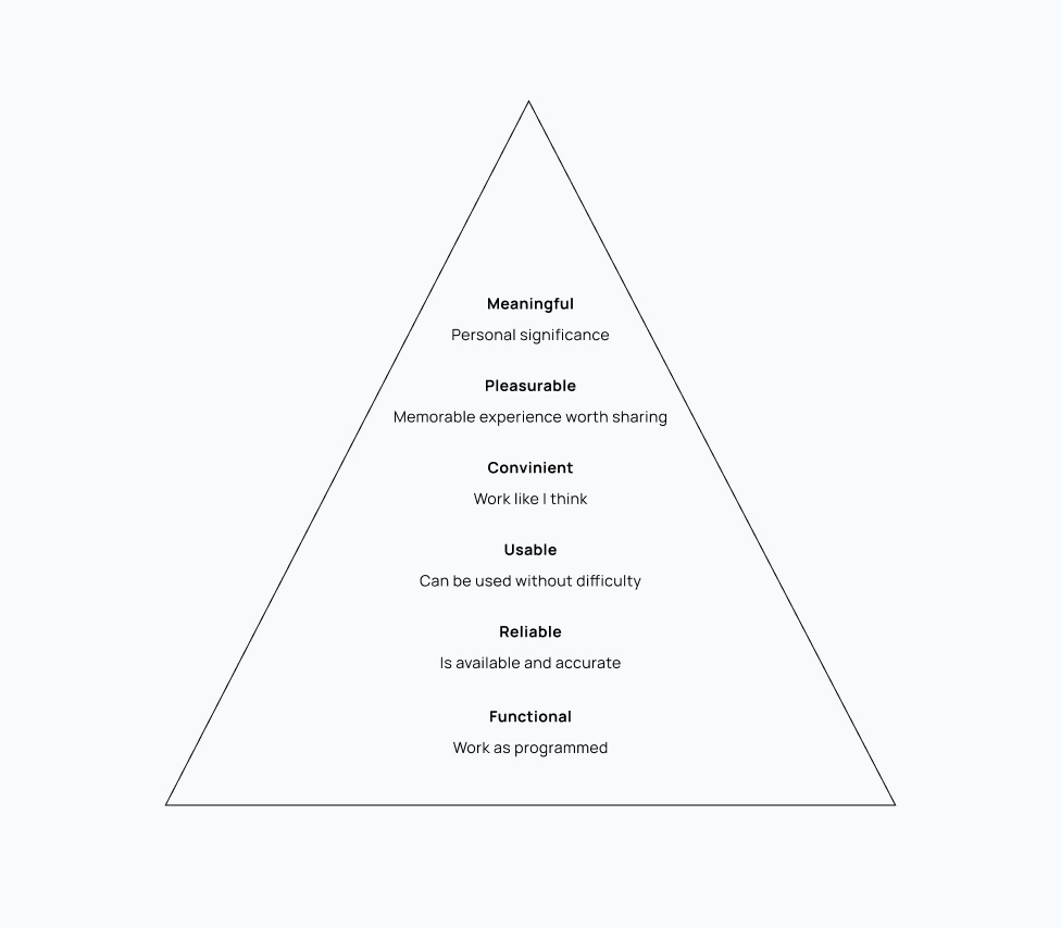
We used Stephen Anderson's UX Hierarchy of Needs which influenced our product strategy.
Our approach
Our brief was to develop and differentiate ourselves in an already mature and competitive market.
We needed to define a desirable app and how it would meet the needs of the users. We were thrilled by the opportunity to create something more meaningful.
We used Stephen Anderson's UX Hierarchy of Needs which influenced our product strategy.
Our approach in phases
Our approach in phases
A culture with lean UX
We used the lean approach which emphasised rapid sketching, prototyping, user feedback and design mockups.
A culture with lean UX
We used the lean approach which emphasised rapid sketching, prototyping, user feedback and design mockups.
Transparency as a trust model
Ample opportunities for input at all stages of the project built trust and a great environment to share ideas.
Transparency as a trust model
Ample opportunities for input at all stages of the project built trust and a great environment to share ideas.
Starting on the same page
Through several meetings with the
stakeholders, we identified risks,expectations
and built a first vision for the app.
Starting on the same page
Through several meetings with the stakeholders, we identified risks,expectations and built
a first vision for the app.
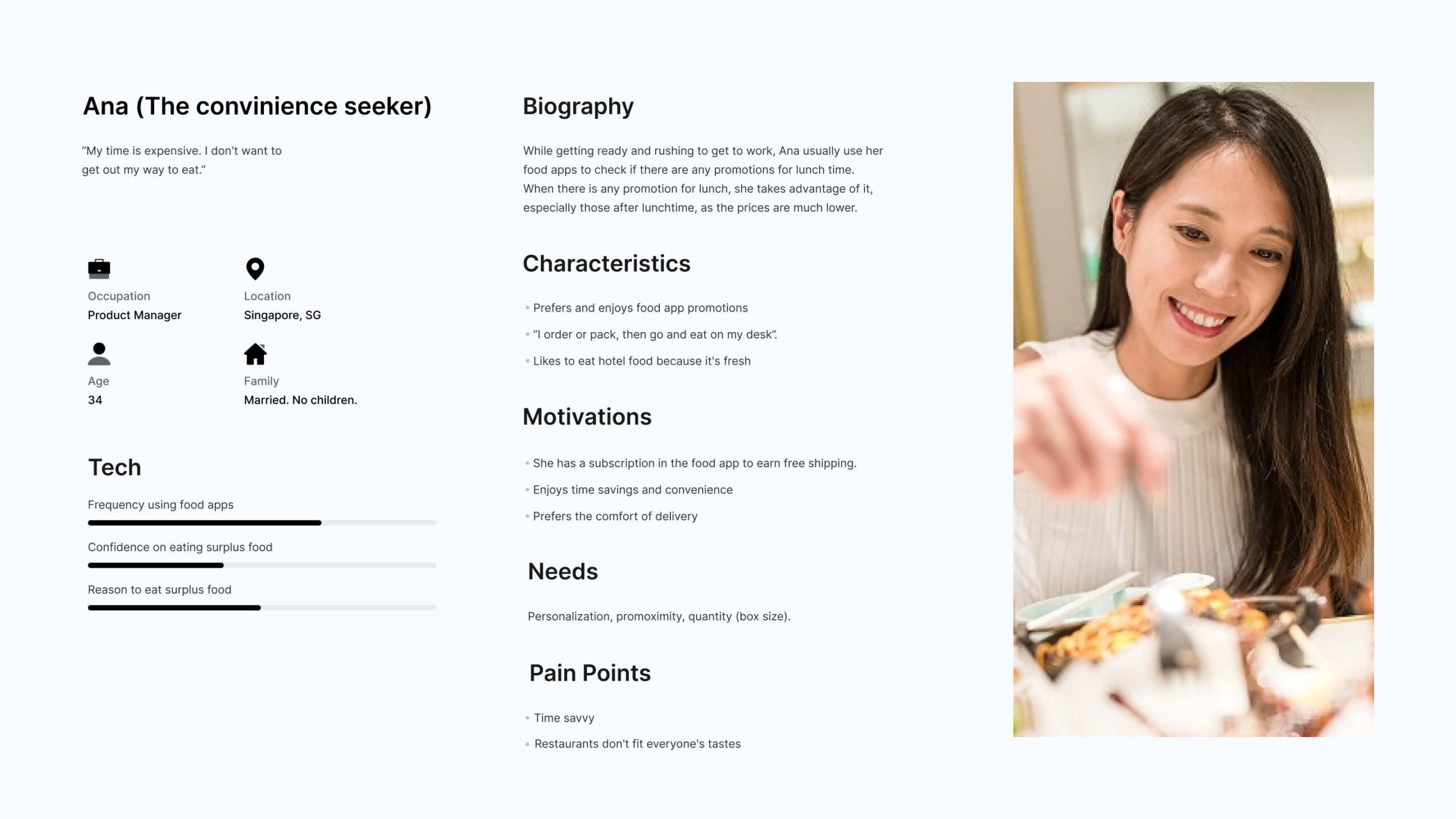
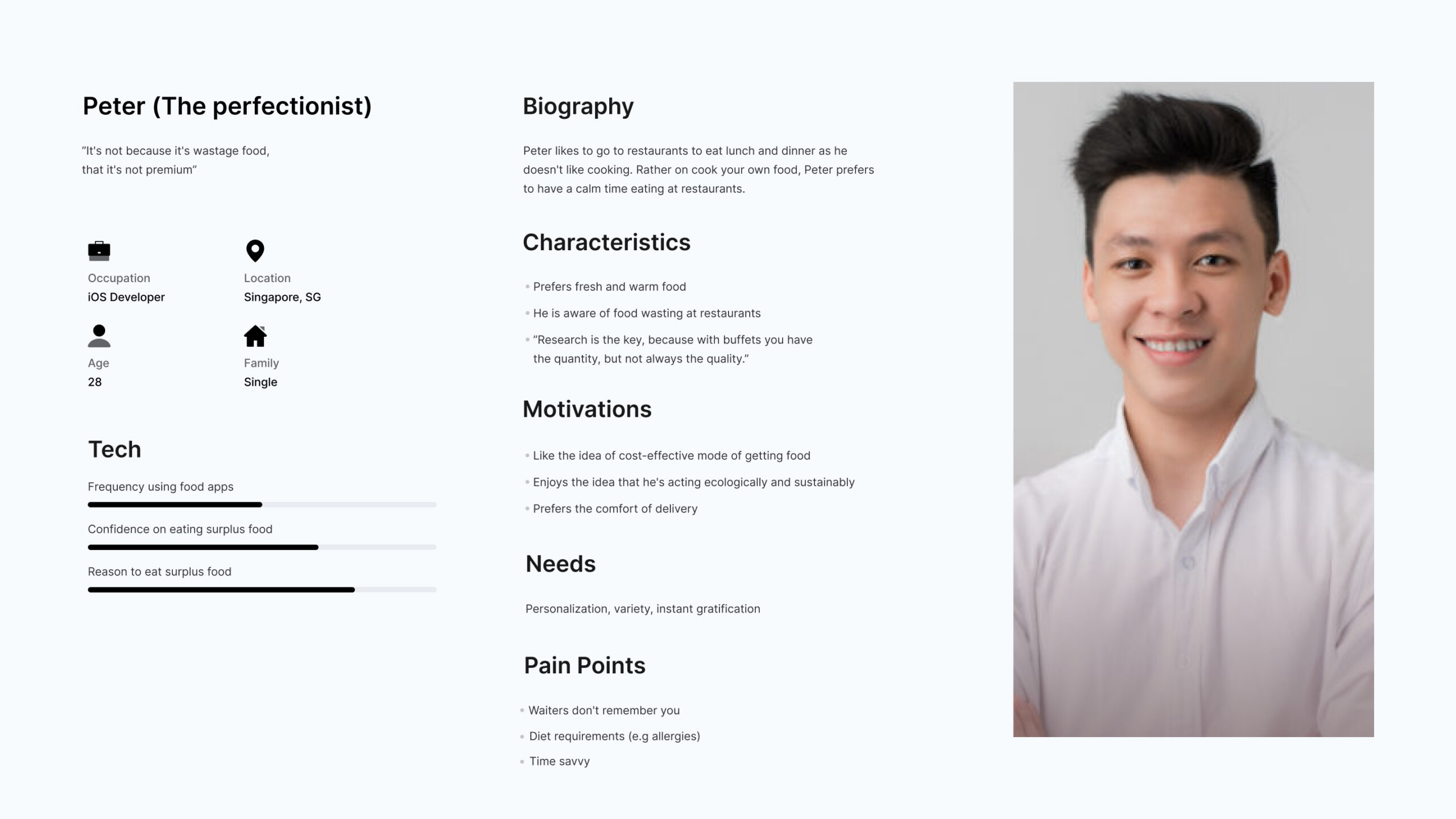
Discovery - What does 'food surplus' mean to you?
The discovery phase was all about defining our milestones, reviewing existing work, analyzing competitors, and diving into user needs and pain points. Weekly interviews with 5 users helped us refine Treatsure’s audience and iterate on the old app design.
Also, our research revealed varying perceptions of 'food surplus,' with distinct motivations and needs. Using this, we developed two personas, Ana and Peter, to guide our design. By analyzing behavioral patterns like usage frequency, and motivations, we tailored the phase 1 app to meet user needs effectively, setting the foundation for future releases.
Discovery - What does 'food surplus' mean to you?
The discovery phase was intense and allowed us to define project milestones, review the existing work and the competitor landscape, get to know our client's vision, begin research into user needs, behaviours and pain‐points.
Our research showed that the concept of 'food surplus' was quite different to users. 5 users were interviewed weekly, to strengthen Treatsure audience and iterate the design of the App. Users' motivations for 'food surplus’ and participating in the research differed, hinting at distinct requirements. After worked on persona types and aligning this with our strategy, we were able to prioritise the early stages.
The phase 1 app focused on supporting the goals of Ana and Peter, our personas.
The personas guided our design decisions and created more empathy amongst the client and our team.
Our persona hypothesis consisted in two different archetypes that were used to facilitate discussions about the needs, desires, and variety usage contexts of our users. Through careful analysis of our research, we have identified enough behavioral patterns to segment our user audience.
These variables were categorized into activities such as frequency of use, thoughts such as food awareness and motivations such as reasons for the consumption of surplus food.
The personas were discussed with our client to get a clear picture of who would be targeting the app design in phase 1 and in future releases.
Discovery - What does 'food surplus' mean to you?
The discovery phase was intense and allowed us to define project milestones, review the existing work and the competitor landscape, get to know our client's vision, and begin research into user needs, behaviours and pain‐points.
Our research showed that the concept of 'food surplus' was quite different to users. Users' motivations for 'food surplus’ and participating in the research differed, hinting at distinct requirements. After worked on persona types and aligning this with our strategy, we were able to prioritise the early stages. The phase 1 app focused on supporting the goals of Ana and Mike, our personas.
The personas guided our design decisions and created more empathy amongst the client and our team.
Our persona hypothesis consisted in two different archetypes that were used to facilitate discussions about the needs, desires, and variety usage contexts of our users. Through careful analysis of our research, we have identified enough behavioral patterns to segment our user audience.
These variables were categorized into activities such as frequency of use, thoughts such as food awareness and motivations such as reasons for the consumption of surplus food.
The personas were discussed with our client to get a clear picture of who would be targeting the app design in phase 1 and in future releases.
The personas guided our design decisions and created more empathy amongst the client and the team.
"The personas guided our design decisions and created more empathy amongst the client and the team."
"The personas guided our design decisions and created more empathy amongst the client and the team."
Vision
While our competitors focus on offering different types, sizes of restaurants and food, our vision was to help users get more pleasure out of getting surplus food, and include Singapore's big hotel restaurants in order to help them sell surplus food at a lower price. We knew that big hotel restaurants suffer from wasted food, so we wanted to become an enabler for a better and sustainable Singapore in this field.
Improve usability
Our key priority for the early stage was to focus on the first task - simplify the app and stay in usability and convenience.
Improve usability
Our key priority for the early stage was to focus on the first task - simplify the app and stay in usability and convenience.

Amplify the app
In addition to the obvious features of the app, we got opportunities to build an emotional connection with our users, creating a more human and transparent app.
Amplify the app
In addition to the obvious features of the app, we got opportunities to build an emotional connection with our users, creating a more human and transparent app.
Spread the word
We had the vision to empower the culture of food reuse in Singapore, where the most frequent users of the app could contribute by spreading the word.
Spread the word
We had the vision to empower
the culture of food reuse
in Singapore, where the most
frequent users of the app could
contribute by spreading the word.
Brand and experience requirements
To communicate the personality of our app to the main stakeholders (client) and team, we developed some experience principles. These were used to double-check design decisions and describe key attributes for the app experience, for both the users and the brand. We used these principles to drive the aesthetic, feel and overall direction of the app.
Awareness
Believe in the app for positive change.
Awareness
Believe in the app for positive change.
Sense of togetherness
Enable users empower and transform the food surplus scene, connecting people.
Sense of togetherness
Enable users empower and transform the food surplus scene, connecting people.
Be simple, but bold.
Find a restaurant should be easy with a bold and unique experience.
Be simple, but bold.
Find a restaurant should be easy with a bold and unique experience.
Tasty experience in all levels
Good food is worth eating,
the app should be too.
Tasty experience in all levels
Eating good food is worth,
the app should be too.
Tasty experience in all levels
Eating good food is worth, the app should be too.
Be encouraging
Deliver unique values, giving users a reason to belong.
Be encouraging
Deliver unique values, giving users a reason to belong.
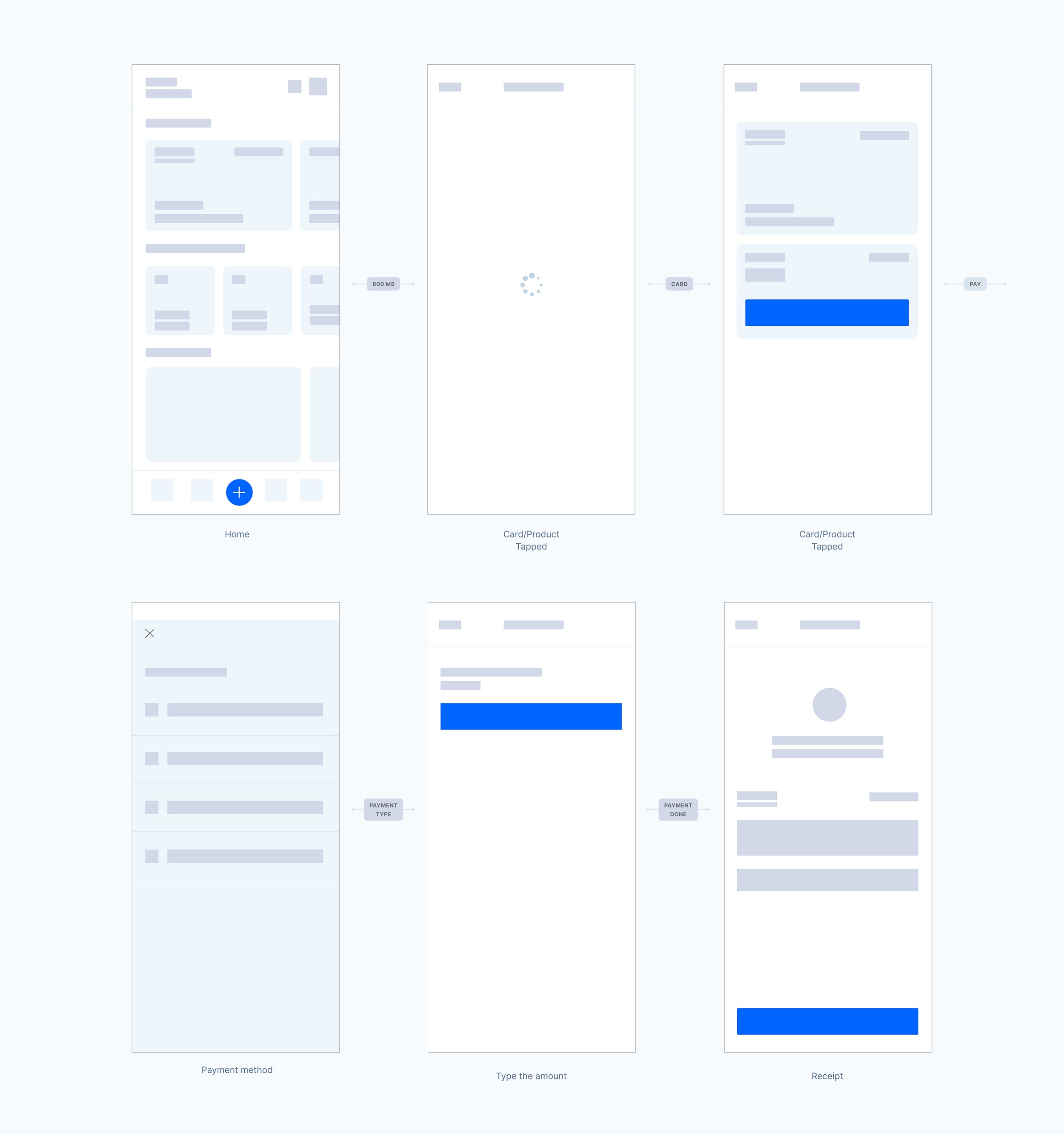
User flow and first sketches
Sketching and storyboarding, we iterated stacks of ideas including the arrangement of UI, data elements, and interactive behaviours. Our vision began evolving into something tangible. After that, a high‐level design experience and the app's anatomy came to live.
Design direction
Sketching and storyboarding, I iterated stacks of ideas including the arrangement of UI, data elements, and interactive behaviours. Our vision began evolving into something tangible. A high‐level design experience and the app's anatomy came to live.
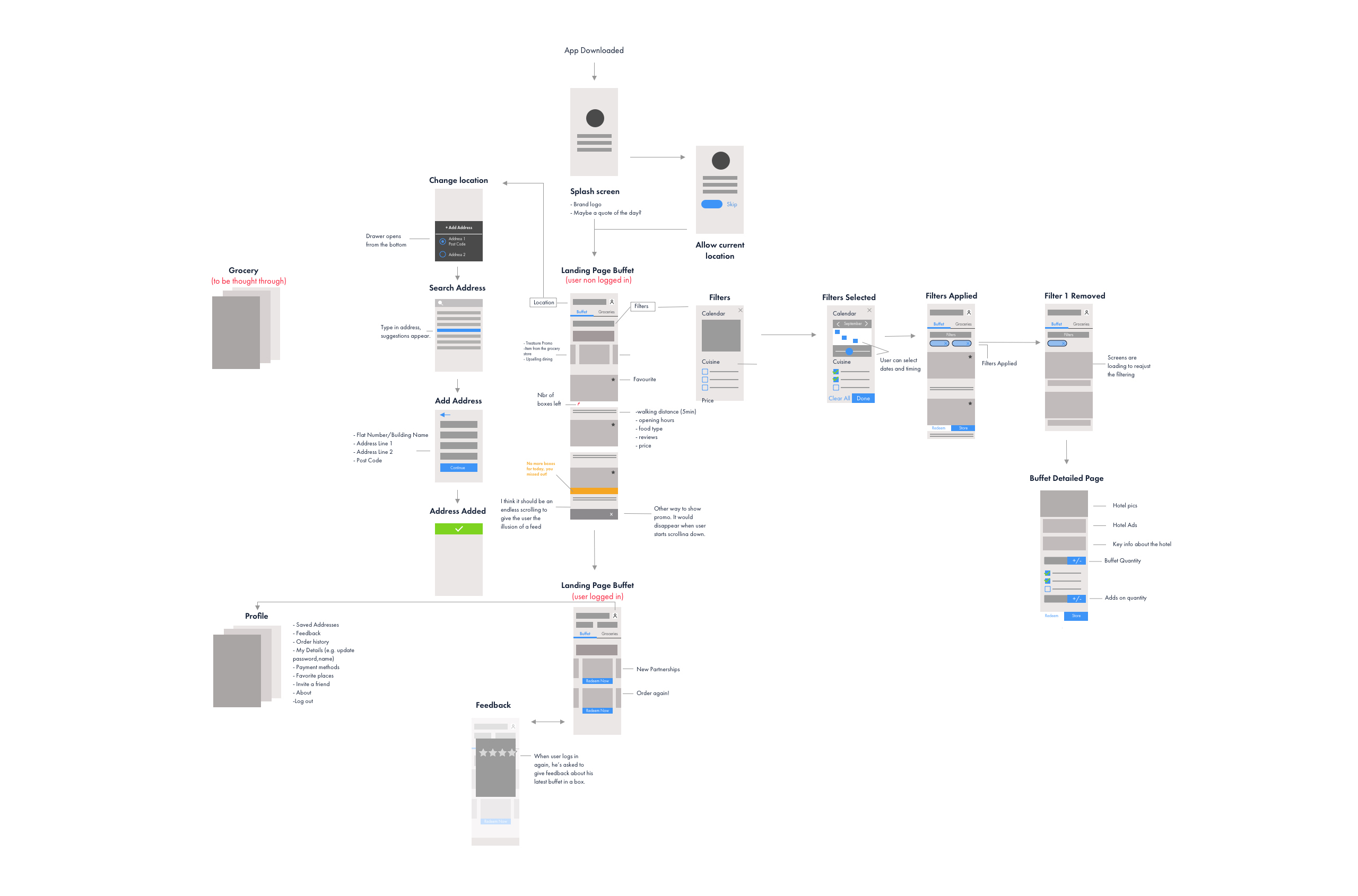
Blockframes
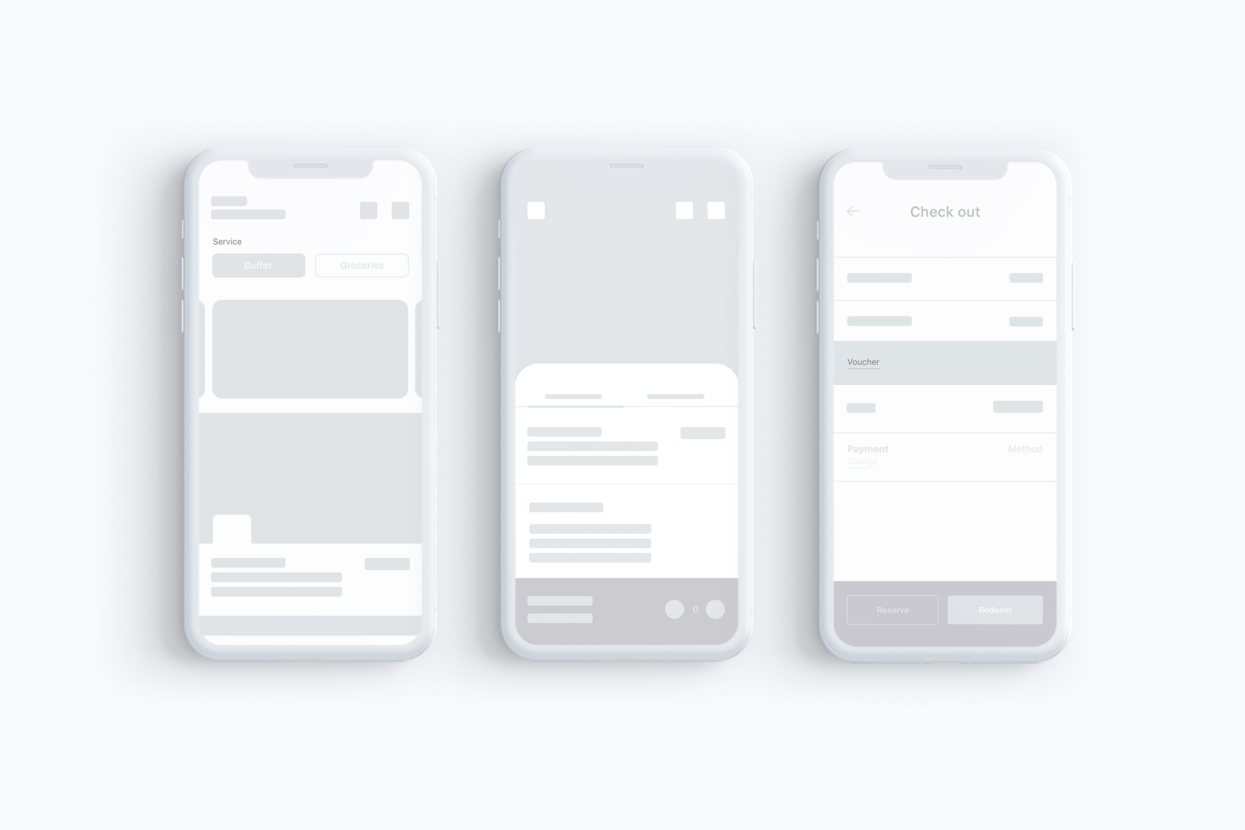
Based on the user flow above, I started to create the blockframes for the home screen and worked on the checkout flow.
Wireframes
Based on the user flow above, I started to wireframe different options
for the home screen and worked on the checkout flow.
Detailed designs
Designing with Emotion in Mind
For all user flow, our aim was to amplify the positive aspects of engaging with surplus food and help users focus on the good memories associated with it. That's why we applied principles of emotional design, therefore we focused on 2 levels of of cognitive responses:
Visceral: We made sure the interface felt clean, modern, and easy to use from the very first tap: uncluttered layouts, and intuitive navigation. These choices helped create that “this looks easy” feeling, making users to explore more without feeling overwhelmed.
Reflective: Beyond looks, we wanted treatsure users to feel good about using the app. So we highlighted the benefits after the checkout, like how much they saved, or how much food they helped rescue. That emotional connection is what encourages people to come back and even spread the word.
Building Trust and creating a "Sense of urgency"
By following a few principles of Persuasive design, we aimed to positively shape Treatsure users’ behavior and decisions. For that, we applied the following principles:
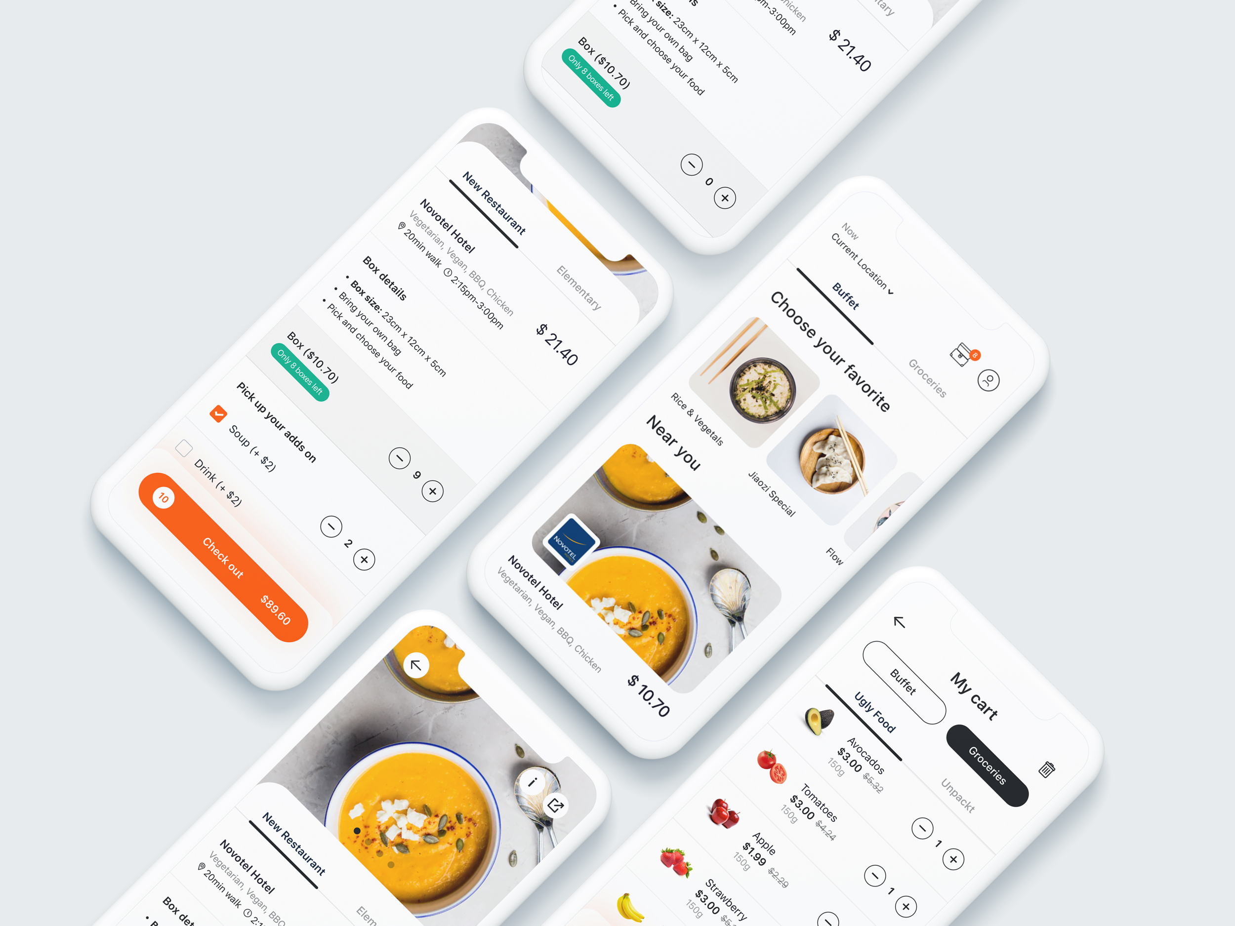
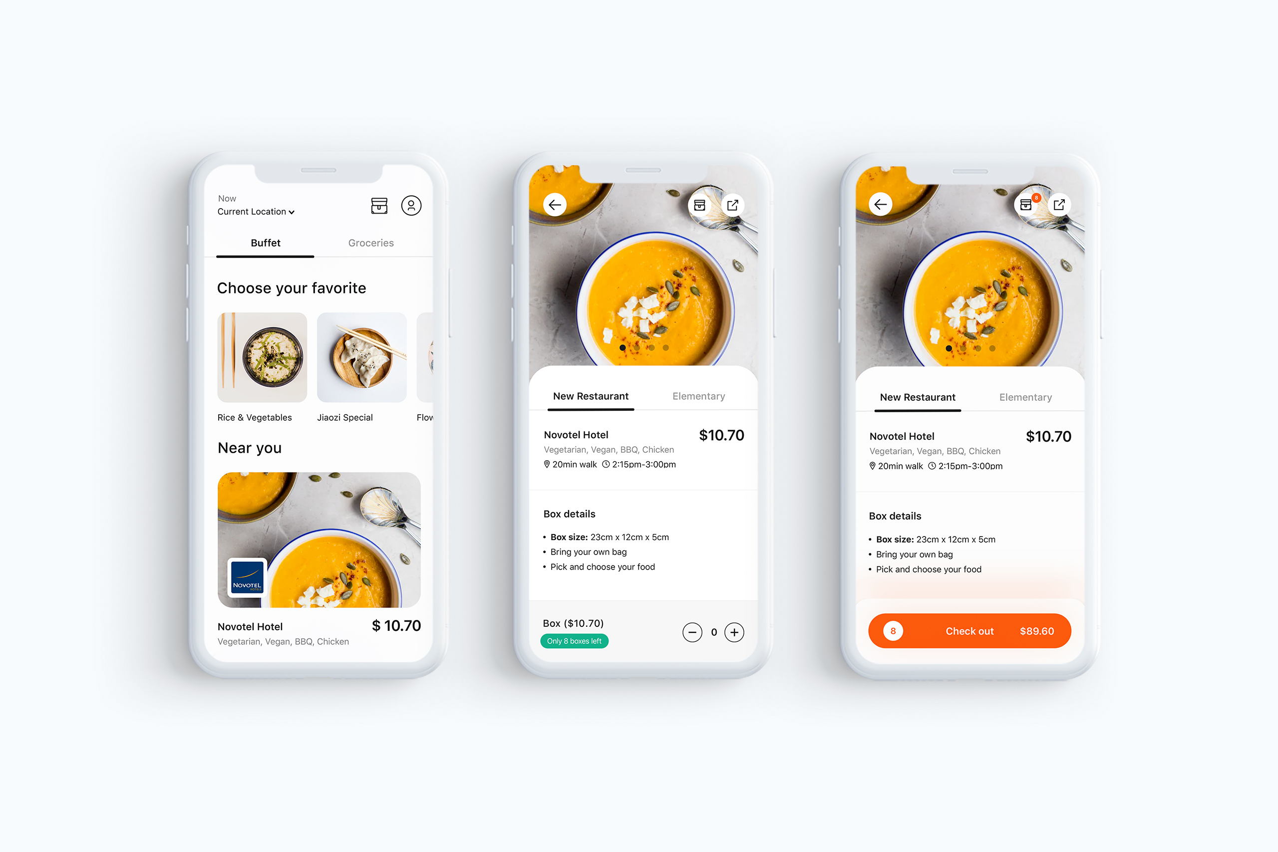
Authority: We were super transparent about what users could expect, like clearly showing meal details, dietary restrictions, clear prices, and restaurant distance and opening times. That way, there were no surprises, just clear info that helped build trust. On top of that, we used high-quality, professional-looking visuals that matched Treatsure’s branding to give everything a polished and trustworthy feel.
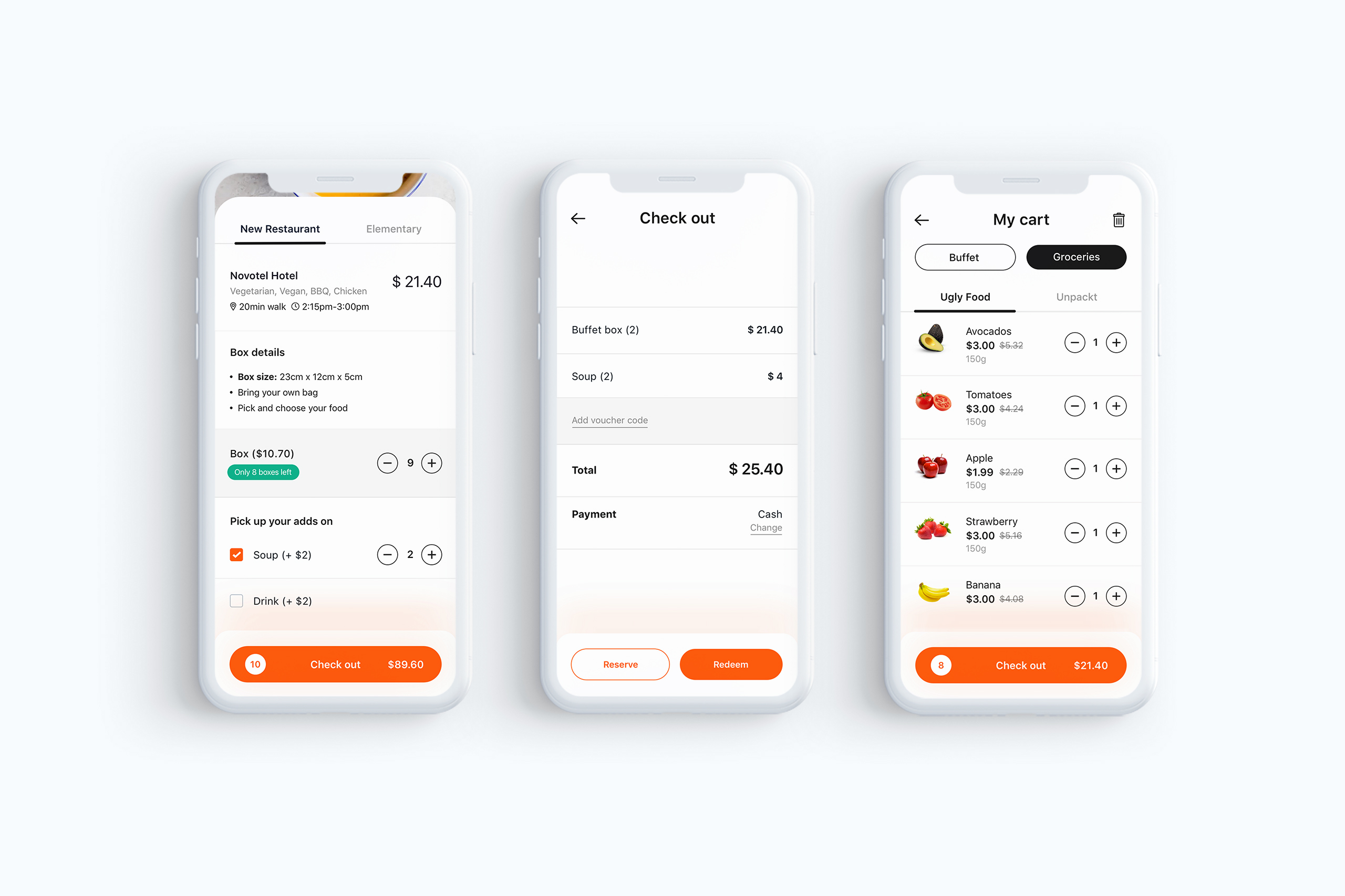
Loss aversion: Nobody likes missing out, so we used that to our advantage. We added subtle nudges like 'Only 8 boxes left' to create a healthy sense of urgency during the purchase flow. It encouraged users to act fast, especially when they saw something they liked, without feeling pressured.
Detailed designs
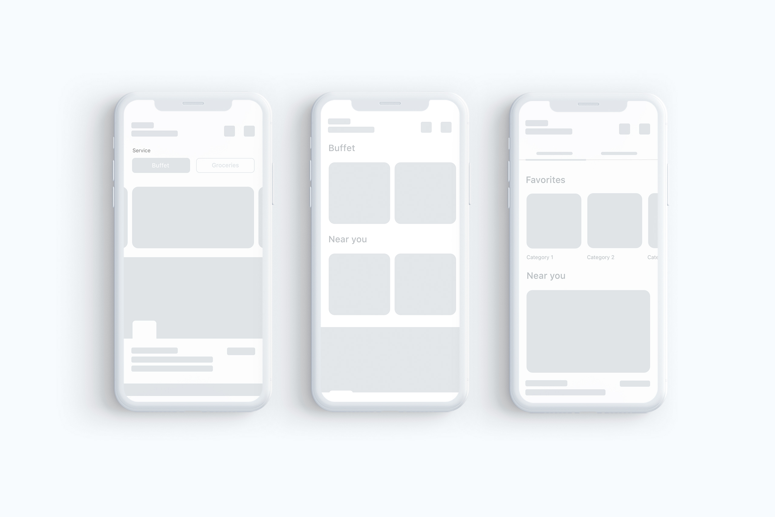
Make important things fast
The main screen has been designed to allow users quick access to primary sections of the application. The size of the photos make tapping easier, the order of the photos are based on ease of reach and the layout was chosen to provide a way for the design to scale for future releases.
The UI strives to be confident. It does not contain unnecessary elements. We choose for clear and readable typography — colours with high contrast to increase legibility in low‑light conditions.
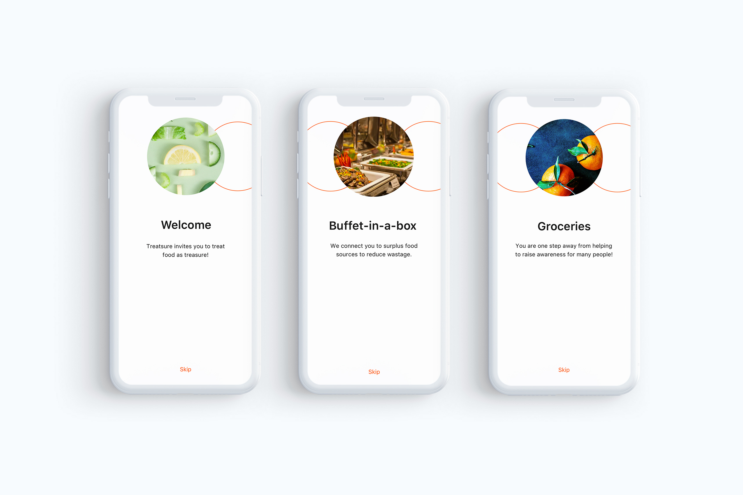
Detailed designs - Onboarding
We also applied techniques of Emotional Design within the onboarding screens to inspire users about surplus food. We used techniques to evoke emotions in users, like great use of color, typography, writing and imagery.
As seen below, we also crafted a good copy with the right tone to inspire emotions as we wanted to create a sense of awareness and let users know they were acting in a sustainable way.
Detailed designs - Onboarding
The app leverages principles of Emotional Design to help and inspire users to be aware of surplus food. In doing this, we hoped to amplify the positive aspects of getting surplus food and help users focus on good memories. As seen below, we also crafted a good copy with the right tone to inspire emotions as we wanted to create a sense of awareness and let users know they were acting in a sustainable way.
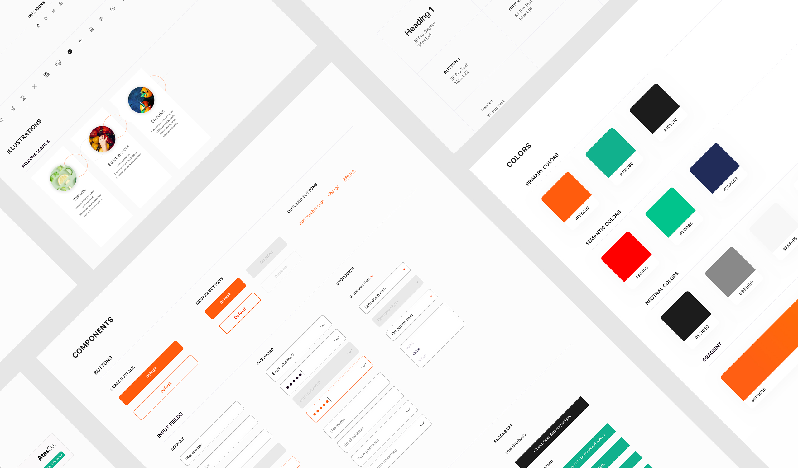
Styleguide
In order to bring consistency through the product's user interface and experience we designed a complete Styleguide as showed below.
Styleguide
In order to bring consistency through the product's user interface and experience
we designed a complete Styleguide as showed below.
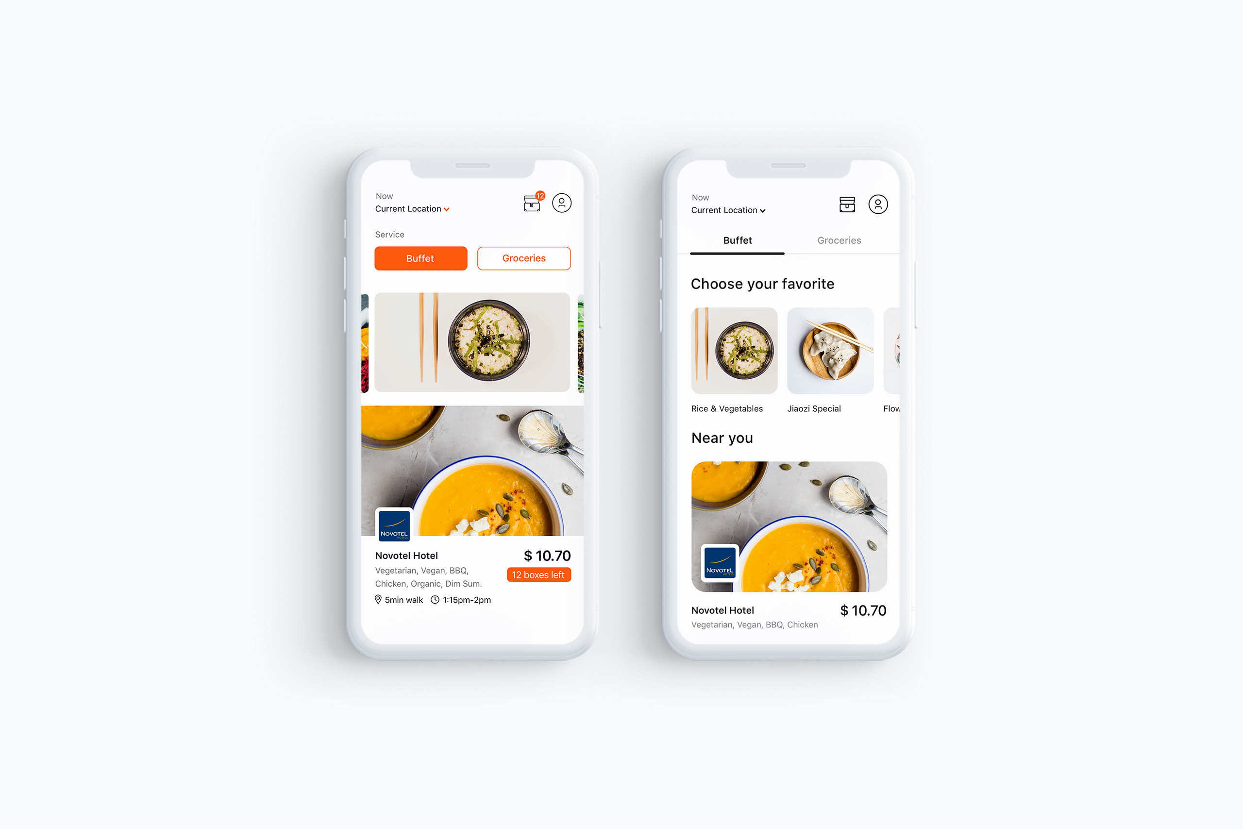
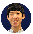
Testing with users
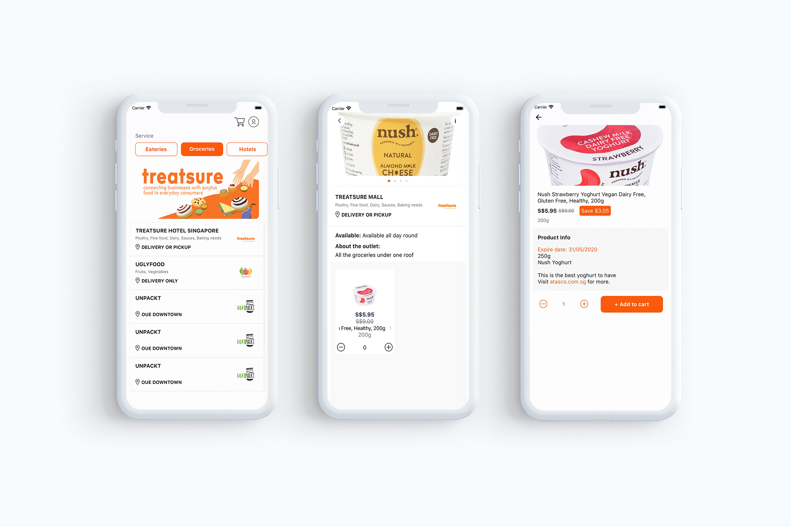
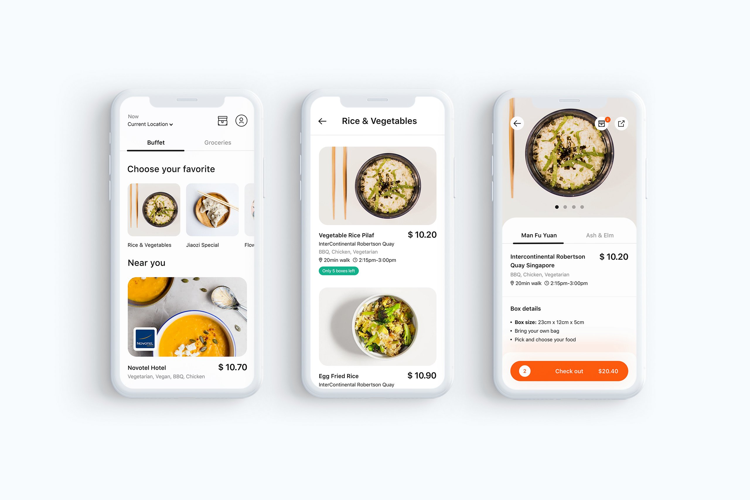
When we tested the app with users, we noticed that the Home screen wasn’t working as well as it could. Some users mentioned they didn’t really get what the big banners were for, and felt they were too wide, like they wanted a little preview of what was coming next. So, we added titles and subtitles to give more context to the dishes and adjusted the banners to a square format, which made the layout feel more balanced and easier to scan.
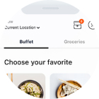
We also took a closer look at the ‘Near you’ section. A few users were confused when tapping on ‘Buffet' as they expected to be taken to a new screen, but actually the section just switched to show ‘Groceries’ in the same view. To clear that up, we introduced a high-contrast tab design so it looked and felt more like an interactive element. And after some testing, the feedback was super positive: users found the layout more intuitive and easier to navigate.
And to make sure we weren’t just relying on our 'gut feeling', we backed all of this up with A/B testing using Firebase as a tool. Then it helped us compare the previous home screen with the new ones, and the data confirmed what we were seeing in user sessions: more interaction with the banners and smoother navigation between sections (tabs).
Testing with users
Through testing with users, we observed that the preliminary app's Home option could be improved. Some users reported not knowing what the first (larger) banners were and that they were very long in width. For that we added a title and respective subtitles for the food dishes.
To act consistently, we've added a title and updated the layout of the 'Near you' section with rounded corners and a more minimalist layout. Some users have reported that when they tapped on 'Buffet' they were expecting to go to another screen. But the primary action would be to stay on the same screen and just switch the 'Buffet' section to 'Groceries'.
We addressed this issue by using a high contrast Tab to increase user cognition and promote a pleasing layout.
The KPIs
To ensure that Treatsure was hitting the right goals, we worked with stakeholders to set a few key KPIs that helped track how well the platform was reducing food waste, engaging users, and getting restaurants on board.The KPI's were:
- User engagement: used this to track how often users were using the app and making purchases + returning visitors
- Food waste reduction: used this one to measure how much food was saved from going to waste, so we knew if the app was doing its job in reducing waste.
- Restaurant participation/transactions: used to track of how many restaurants were joining and how many transactions were happening.
KPI's validation
About four months after launch, we took a step back to see how well Treatsure app was performing. Together with our UX Research Lead and stakeholders, we checked in on our KPIs to make sure we were on the right track.
Methodologies we used:
- Survey: We asked users for feedback to understand how they were feeling about the app, such as what they liked, and what could be better
- User interviews: We had deeper conversations to really get into the why behind user behavior. This helped us spot pain points and opportunities
- Data analytics: We tracked platform usage through tools like Google analytics to see how the app was performing against our goals in real numbers
Key metrics tracked:
- User interactions: How often were people logging in, browsing, or engaging with food listings?
- Food saved: How much surplus food were users actually rescuing through the app?
- Restaurant signups: How many new restaurant partners were coming on board and actively listing surplus meals?
Key results:
- User engagement went up by 25%. We noticed a solid boost in daily active users and a rise in returning visitors
- Food saved hit over 2,200 kg in just four months (!!!), which felt like a huge win for the mission LoL
- Restaurant signups jumped by 40%, which led to 30% more transactions and a livelier platform overall
Testing with users
Through testing with users, we observed that the preliminary app's Home option could be improved. Some users reported not knowing what the first (larger) banners were and that they were very long in width. For that we added a title and respective subtitles for the food dishes.
To act consistently, we've added a title and updated the layout of the 'Near you' section with rounded corners and a more minimalist layout. Some users have reported that when they tapped on 'Buffet' they were expecting to go to another screen. But the primary action would be to stay on the same screen and just switch the 'Buffet' section to 'Groceries'.
We addressed this issue by using a high contrast Tab to increase user cognition and promote a pleasing layout.
"A thorough research with users helped us to create a fascinating app and branding!"
"A thorough research with users helped us to create a fascinating app and branding!"
Preston Wong, CEO & Lead Innovator
Treatsure